CASE STUDY
Context
I focused on changing the visuals to the conversation, in order to work past the stigma. In British Columbia, 1/5 struggle with addiction, with doctors prescribing opioid pain killers for 1 in every 2 citizens. Fentanyl is smuggled through ports and the mail into B.C., where drug dealers cut it with other drugs, which are then sold as Oxycontins or heroin. Fentanyl is over 100 times more toxic than morphine and has lead to 1,400 of Canada's 2,458 opioid deaths in 2017 so far. Targeting such a large problem, my solution would act as only part of the solution to drug addiction.
PROCESS, 3 QUERIES & RESEARCH
Query 1: Should we worry about the effects of long waiting lines?
Sources: Drug Treatment Outcomes for Persons on Waiting Lists from the American Journal of Drug and Alcohol Abuse; Are there enough beds for drug treatment in B.C.? from CBC News; and Waiting Time as a Barrier to Treatment Entry: Perceptions of Substance Users by the Journal of Drug Issues

Conclusion: A significant portion of people aren't receiving the treatment they're actively looking for. People want to be involved in a program and go through treatment, but the long wait lists make it difficult to stay abstinent with minimal support.
Objective: I researched the consequences of waiting lines on admittance to rehabilitation centers by reading articles and journal entries on the topic.
Results: Found a 40% drop off from the waiting list within 2 weeks, with the average waiting tolerance being one month. A shortage of drug treatment was the cause of 25% of over 5 million people not attending treatment in the USA. The second source showed wait lists for B.C. beds are over one month.
Results: Found a 40% drop off from the waiting list within 2 weeks, with the average waiting tolerance being one month. A shortage of drug treatment was the cause of 25% of over 5 million people not attending treatment in the USA. The second source showed wait lists for B.C. beds are over one month.
Query 2: What are the social benefits of rehabilitation?
Sources: 6: Cost effectiveness of drug treatment. from the National Institute on Drug Abuse; Drug Rehab Instead of Prison Could Save Billions, Says Report from Rehab International; and Inside the Plan to Get 100,000 Homeless Off the Streets. by Abigail Tucker of Smithsonian Magazine.

Conclusion: It can be said that for ever one dollar spent on housing and treating addicts, up to twelve dollars can be saved in medical, policing and other societal costs.
Objective: To gather multiple view points on the benefits of rehabilitation for the Canadian public and tax payers.
Results: Found a wide range of quantitative results that show a positive financial benefit to rehabilitation centers and spending money on this problem.
Results: Found a wide range of quantitative results that show a positive financial benefit to rehabilitation centers and spending money on this problem.
Query 3: How do people feel about rehabilitation centers?
Source: Three surveys I created on Demographics, the Vancouver Opioid Crisis in general, and a follow up survey from September 25th 2017, to October 14th 2017; and a Personal Interview with Ken Schmold, a local, former recovery house manager and former addict, asking a series of prepared questions.

Conclusion: In the questionnaires, I found that a majority of respondents supported doing something about the crisis. Many live in neighbourhoods they feel could be improved. 30% of respondents would prefer their money to go somewhere else. Found many are without hope for programs or people getting better.
Objective: To understand the public's current understanding and perception of rehabilitation centers in and around their neighbourhood.
Results: Received a set of qualitative answers on the opinions of various BC residents. From the interview with Ken Schmold, a former rehabilitation house manager and former addict, we can conclude that there is a perception of corruption and misuse of funds in public rehabilitation housing, but that there is a significant need for more beds.
Results: Received a set of qualitative answers on the opinions of various BC residents. From the interview with Ken Schmold, a former rehabilitation house manager and former addict, we can conclude that there is a perception of corruption and misuse of funds in public rehabilitation housing, but that there is a significant need for more beds.
PROCESS, Diving in to the Problem
After diving into the problem by researching those questions, it became clear that some people were under the wrong impressions. Many think that only life-long drug users in small sections of the province are affected by the drug crisis, and so don't see any immediate benefit. The reality is that even in remote, Northern Communities, there are a lack of rehabilitation beds, which makes this a province wide problem that the province has jurisdiction over.
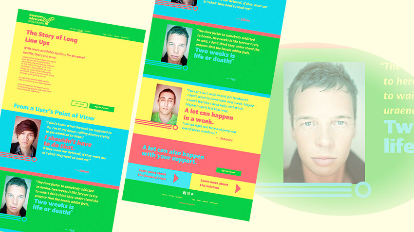
Long line-ups for rehabilitation programs have been found to complicate treatment, and, in up to 40% of cases end the process all together, because people will often change their minds without the support. My communication target for this project was to make taxpayers more comfortable paying for rehabilitation programs.
Process, The Organization
My next steps were to write a Brief and a Brand Blueprint, which included creating an Organization, which I called Recovery Advocates of British Columbia. I described the Vision, Product Benefits, Values, Personality and Target Audience. The communication materials were designed based on "how long ... the product would be in the market" and "why [they] matter".
Recovery Advocates of British Columbia's main mission is to ensure there are enough rehab beds for those that need it. They also educate the public on addiction; Narcan delivery, and the effects of overdose on society. They believe it’s a basic human right to be treated properly, and believe everybody should have an opportunity to make their life better.
I divided this mission into three Pillars from elements I found missing in the target audience and other campaigns.
Hope
is something we can all use but was missing from the target audience survey. There was a clear lack of optimism for people with addiction even though it's a crucial part of change.
is something we can all use but was missing from the target audience survey. There was a clear lack of optimism for people with addiction even though it's a crucial part of change.
Compassion
because empathetic listening and understanding underlines the process of transforming the stories that you'll hear from the demographic affected by the overdose crisis and a lack of rehabilitation beds.
because empathetic listening and understanding underlines the process of transforming the stories that you'll hear from the demographic affected by the overdose crisis and a lack of rehabilitation beds.
Energy
since, from analyzing other campaigns, I recognized a certain voice lacking. There's an urgency to this problem that wasn't being addressed through toned-down imagery, which I wanted to emphasize. Energized, upbeat advertisements are also easier to approach, which became part of my main strategy.
since, from analyzing other campaigns, I recognized a certain voice lacking. There's an urgency to this problem that wasn't being addressed through toned-down imagery, which I wanted to emphasize. Energized, upbeat advertisements are also easier to approach, which became part of my main strategy.
PROCESS, Audience
The audience was narrowed down to people who are unsure about their feelings towards rehabilitation spending, who tend to be younger tax payers. They are concerned about government spending, and some lack confidence with leadership. They might call for things like education or day care spending over this problem and need reasons why they should support it.
Process, the posters

THE LOGO
I started with the basics of what the organization is, what it does, who it connects, and its value system.

Logos with movement, based on the third pillar of "energized".

Logos with an iconographic base, including hugs; beds and transformation.
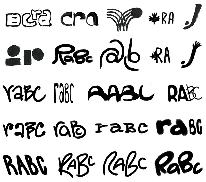
Logos that are based on typography; wordmarks

Vectorized logo, version one

Vectorized logo, version two

Vectorized logo, version three
Solution

Solution, Logo
I created this bouncing ball, which reflects the recovery process as it turns from green to yellow. It shapes into a lowercase r as well, for "recovery". The three bounce lines reflect the three pillars of the organization, Hope, Compassion and Energy.
Solution, Website Mockup, Navigation
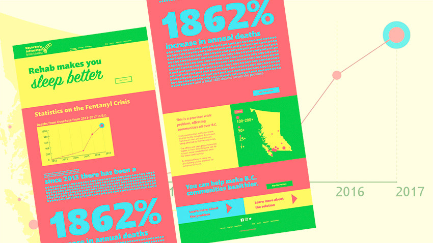
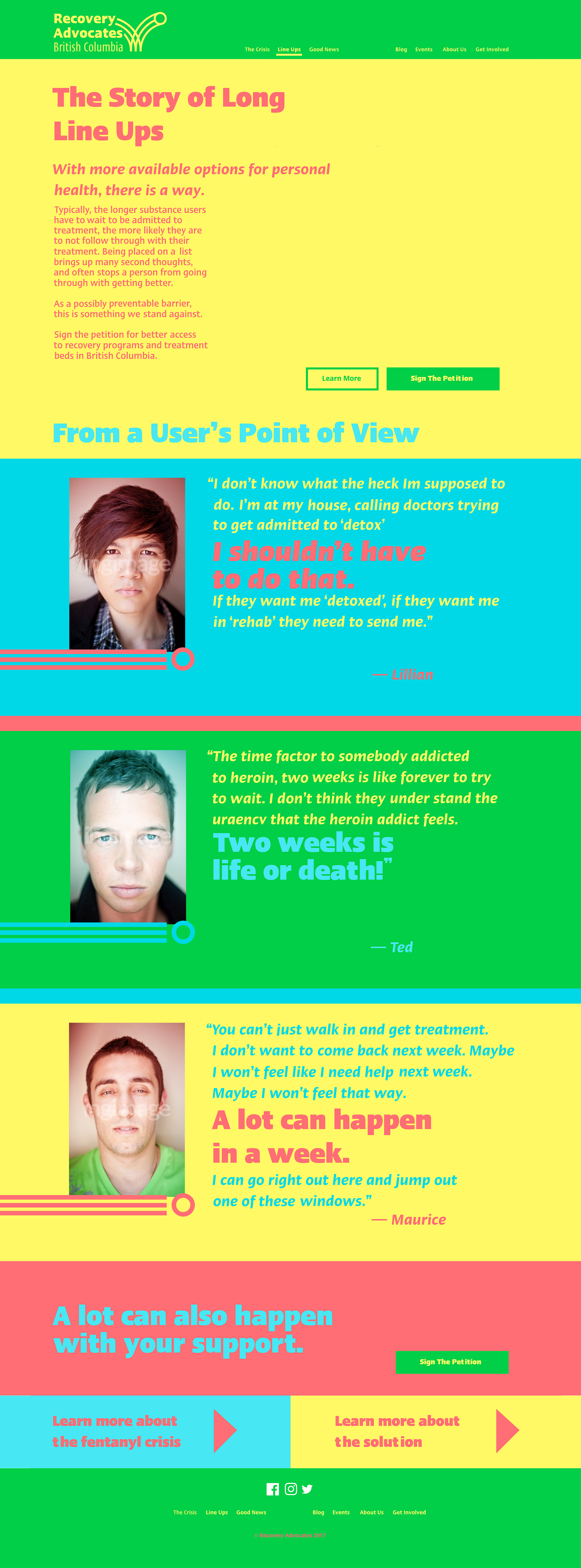
The navigation is a miniature version of the story the NPO is trying to tell, including pages that summarize the problem, dive deeper into one of the aspects of the problem, sand some "Good News."
The Crisis
Line Ups
Good News
Blog
Events
About Us
Get Involved
Line Ups
Good News
Blog
Events
About Us
Get Involved
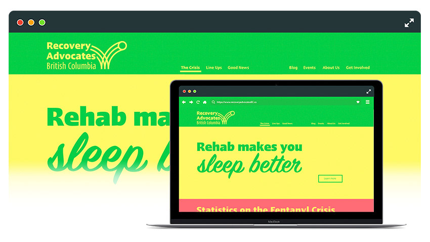
Solution, Website Mockup > The Crisis
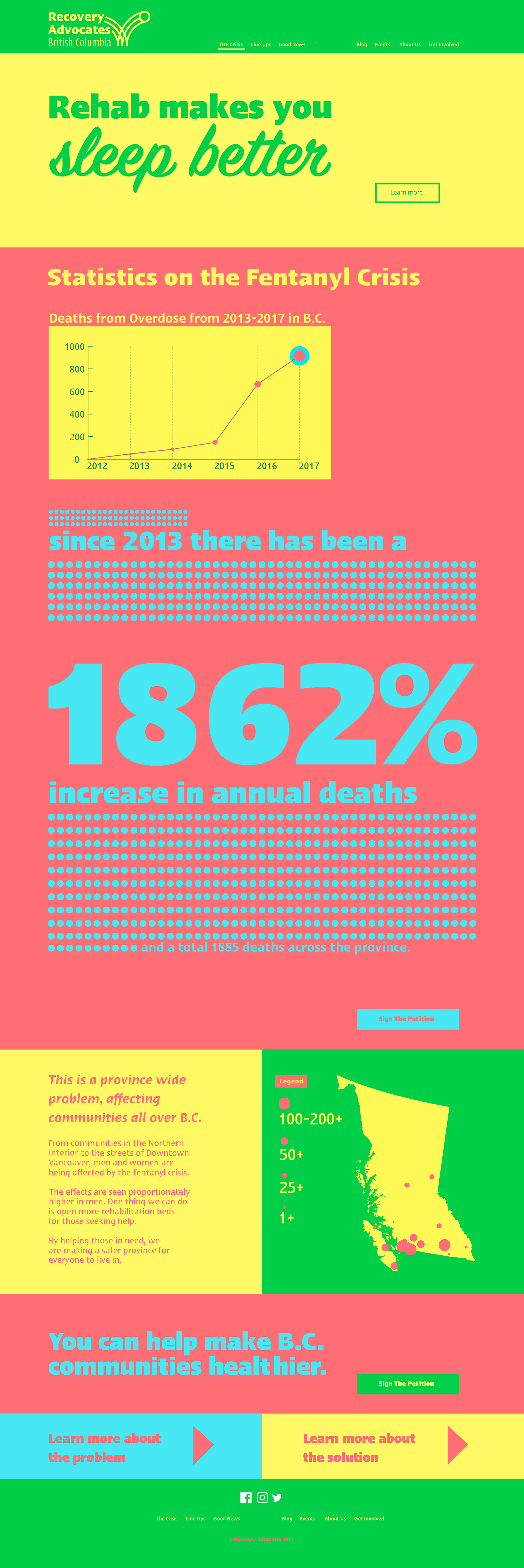
Solution, Website Mockup > Line Ups
Solution, Colours
The colours #FDFB65, #89E5F3, #71CF4D and #E36B71 were chosen for their vibrancy and how they would work off of each other. This type of gaudy colour scheme is not normally associated with this topic, which made it an excellent choice to turn this topic on its head. Given enough weight, the typefaces can be read against the colours in combinations shown in the bottom row in the accompanying graphic.

Sample from the typeface Ergo LT Pro

Sample from the typeface SignPainter HouseScript
Solution, Typefaces
The typefaces Ergo LT Pro and SignPainter HouseScript were chosen for this project based on both the way they function individually and the way they work together. Ergo serves the body and headliner copy by being a sans-serif with the right weights. Its double-story a give and moderate x-height lend it a serious voice, while the heavier weights bring attention to the copy. SignPainter HouseScript gives a handwritten feel to the copy, which lends it more human voice. I use it to draw attention and give emphasis to the main tagline. The styles of the two fonts play off each other, being both casual and factual in the same line.
The two work together on a letter by letter basis as well, with similarities and differences in x-height, bowl size and character width all contributing. With x-heights and leading lined up, characters can be made to have the same stroke width, which blends the two typeface together on a line. Although characters like the lowercase "a" have different styles -- one being a double story versus a single story -- their shared x-height and width bring them together again. Similarly, the handwritten g has a longer tail length than Ergo, but they are drawn in the same style, which brings the pair together again. They can be set to share a similar line weight and have a similar apex, which makes it seem as though they're drawn with the same pen, again bringing the styles closer together. Lastly, Ergo LT Pro has a lot of emphasis on the x-height, such as the height of the crossbar on the t, which brings more attention to that feature. All together, there are enough differences in these two typeface to play them off each other in both body and headline copy.
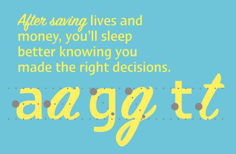
A look at the two typefaces chosen for this project.
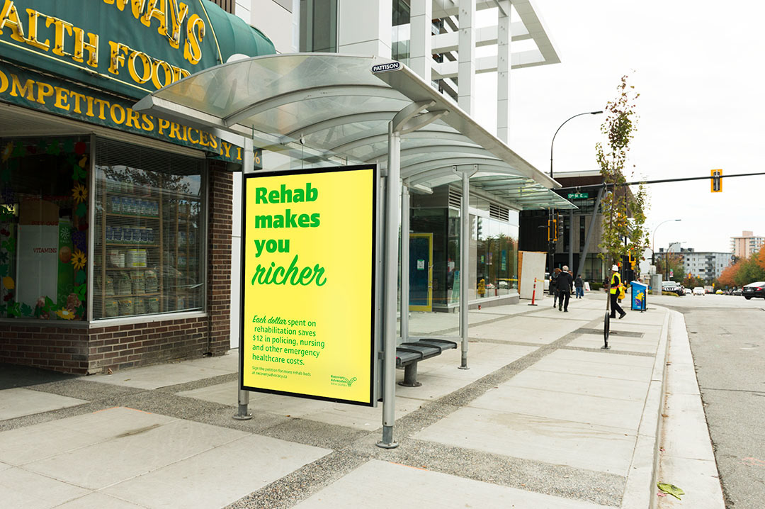
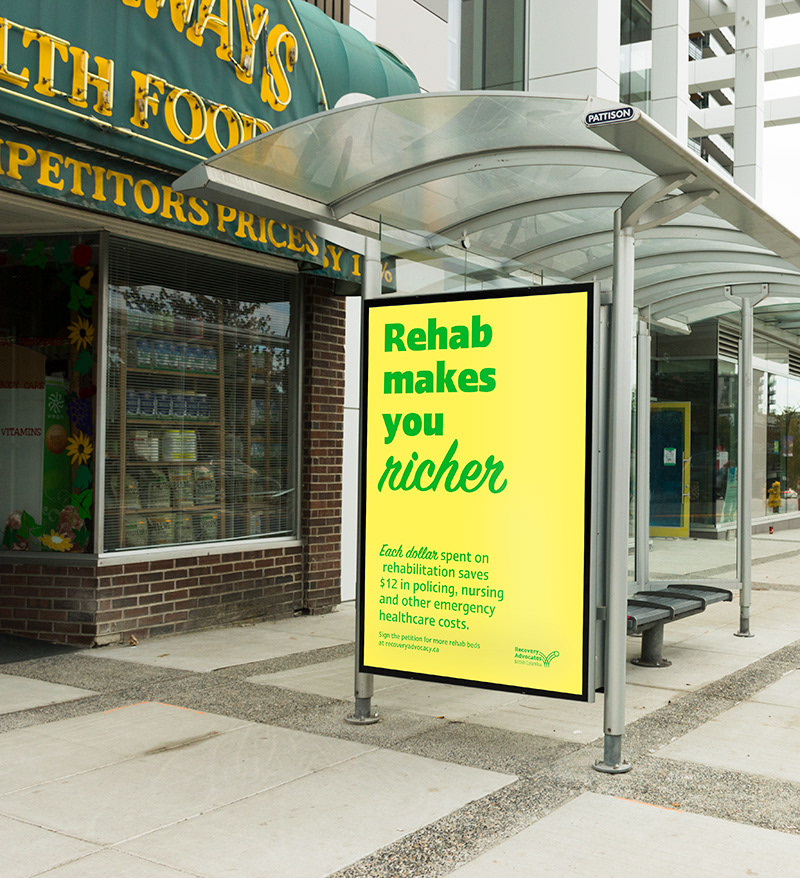
Solution, Advertisements
The posters were designed to communicate with the target audience by starting with a line of copy describing the benefits of rehabilitation that benefit both people who need the rehab beds and the target audience. The second set of copy further clarifies the benefits to the local community.
Each bus shelter poster is based off of a surprise or misconception in the language.
SOLUTION, Website mockups
Bold, bright colours divide a basic website with facts and resources about rehabilitation initiatives and education.
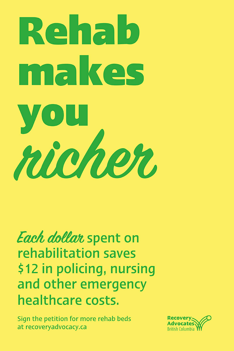
"Rehab makes you richer"
The viewer learns that, in addition to the general knowledge of the benefits of drug rehabilitation, money spent on programs has a direct and measurable effect on public spending. The first impression refers to the stabilizing, financial benefits of recovery programs.

"Rehab helps you sleep better"
The viewer reads about the intangible benefits that come from providing support to people looking to curb their addiction. The first impression refers to an obvious benefit of recover programs.
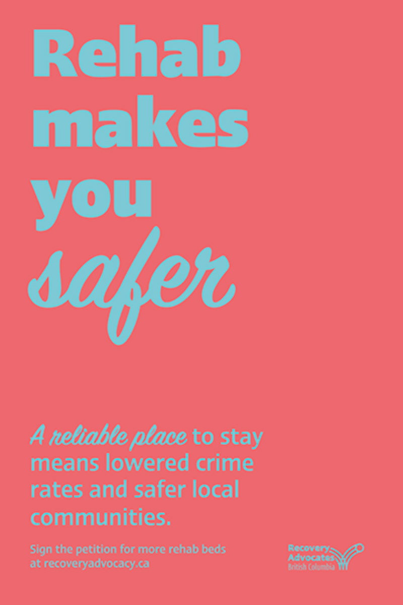
"Rehab makes you safer"
The viewer is shown to the idea of an overall safer communities around
rehabilitation facilities. The first impression refers to a general solution to a common misconception about drug use.
rehabilitation facilities. The first impression refers to a general solution to a common misconception about drug use.