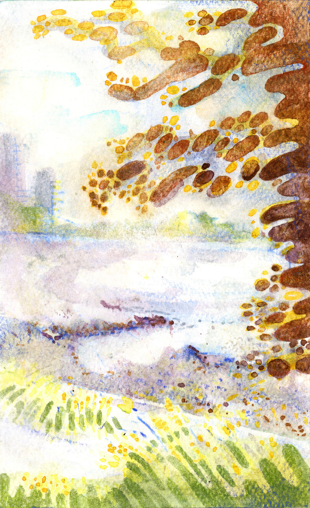
one of two paintings of English Bay, Vancouver. Watercolour en plein air
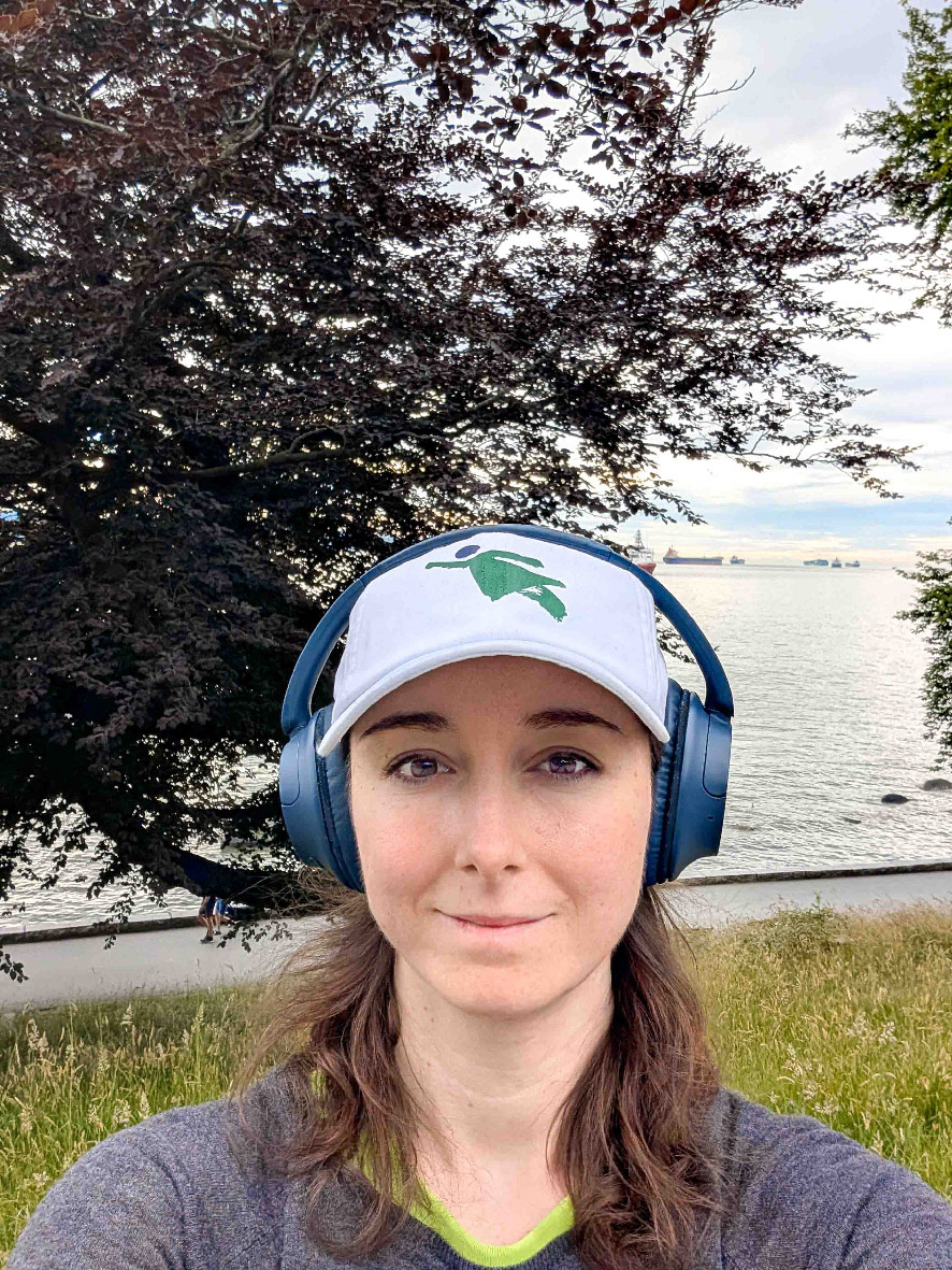
me at english bay, with essentials: hat + headphones
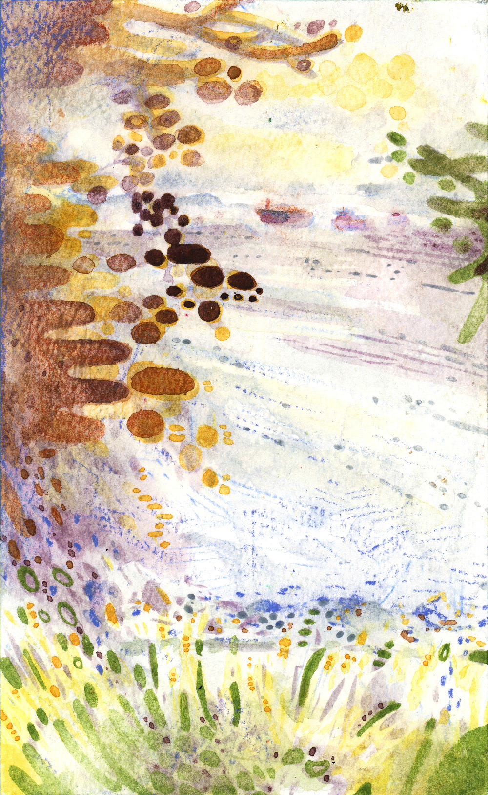
one of two paintings of English Bay, Vancouver. Watercolour en plein air
headers + topics
- tools
- optimizing your outing
- getting into it
- adding the base
- colour choices
- adding the bits
- unifying the composition
- optimizing your outing
- getting into it
- adding the base
- colour choices
- adding the bits
- unifying the composition
This is my set-up, which is pretty maximalist, with a small peek into my minimalist gear. I also go into my process for choosing and applying colours, from sketch to final bits.
This watercolour outing took most of a July day, including scouting for the right spot, setting up, painting (~4 hours) and packing up.
tools
If one thing is certain, it's that you will need something to make your painting with. While some of these things make the outing easier (☺), others make it a lot easier (☻). Choose wisely.
☺ full palette
☺ small/hand palette
☺ neocolour pastels II
☻ watercolour pencils
☻ paper or sketchbook
☺ travel easel
☻ stool
☻ Water
☻ paint water container
☻ brushes or water brush
☺ food
☻ sun protection
☺ small/hand palette
☺ neocolour pastels II
☻ watercolour pencils
☻ paper or sketchbook
☺ travel easel
☻ stool
☻ Water
☻ paint water container
☻ brushes or water brush
☺ food
☻ sun protection
stuff → backpack → bring stuff
on palettes and paints ☻
This one depends on how much you feel like carrying. You could get away with a squeeze of 1-2 paints on a little tray, or you could bring everything, under the fear that you might need it somehow (me). The great thing about Neocolour II pastels is that you can take paint directly from the stick, because they active with water. They have body to them, so you can create a kind of impasto watercolour painting, with just a few crayons. They add great texture on rougher paper and can unify a piece pretty easily.
watercolour pencils vs. Neocolour II pastels ☻
On one hand, watercolor pencils can be more versatile, so I use them at the beginning and end of my process. They can apply a much thinner or more precise mark, so I'd argue they aren't even in the same category as Neocolour II pastels. On the other hand, neocolour pastels can be applied throughout the process. They will catch on the paper and apply colour, even if the surface is a bit damp, whereas watercolour pencils mostly work on a dried surface.
on brushes ☻
I generally just opt for my travel water brush, although I’ve brought sets of bushes before. Since it is harsh on the brushes, I prefer to only bring some cheap but versatile, acrylic square brushes. I use these (or a much larger brush for larger canvases) to fill in washes of colour, or to create geometric lines.food is pretty good. I usually bring shelf-stable food, like peanut butter sandwiches or snack bars, so I can stick it out for longer sessions. Sometimes it takes a while to find a spot.
on food ☻
on sun protection ☻
optimizing your outing
This is going to be different for everyone, but pick a spot that has enough interest (colour, shapes, texture, composition) to work with.
For watercolour, the water on the paper needs to evaporate. I prefer to go on hot, sunny days, which can make co-ordinating more difficult. To avoid watching paint dry, I will work on two, or bring my sketchbook and make smaller studies.
Benches don’t always have the best view, but they can leave you space to spread your materials out. In a good scenario, you are in the shade and have somewhere to sit that isn’t your chair, so it can act as a table.
In the best possible scenario, you have a bit of sun next to you that isn’t going to shift directly onto you, where you can dry/warm your painting.
In the best possible scenario, you have a bit of sun next to you that isn’t going to shift directly onto you, where you can dry/warm your painting.
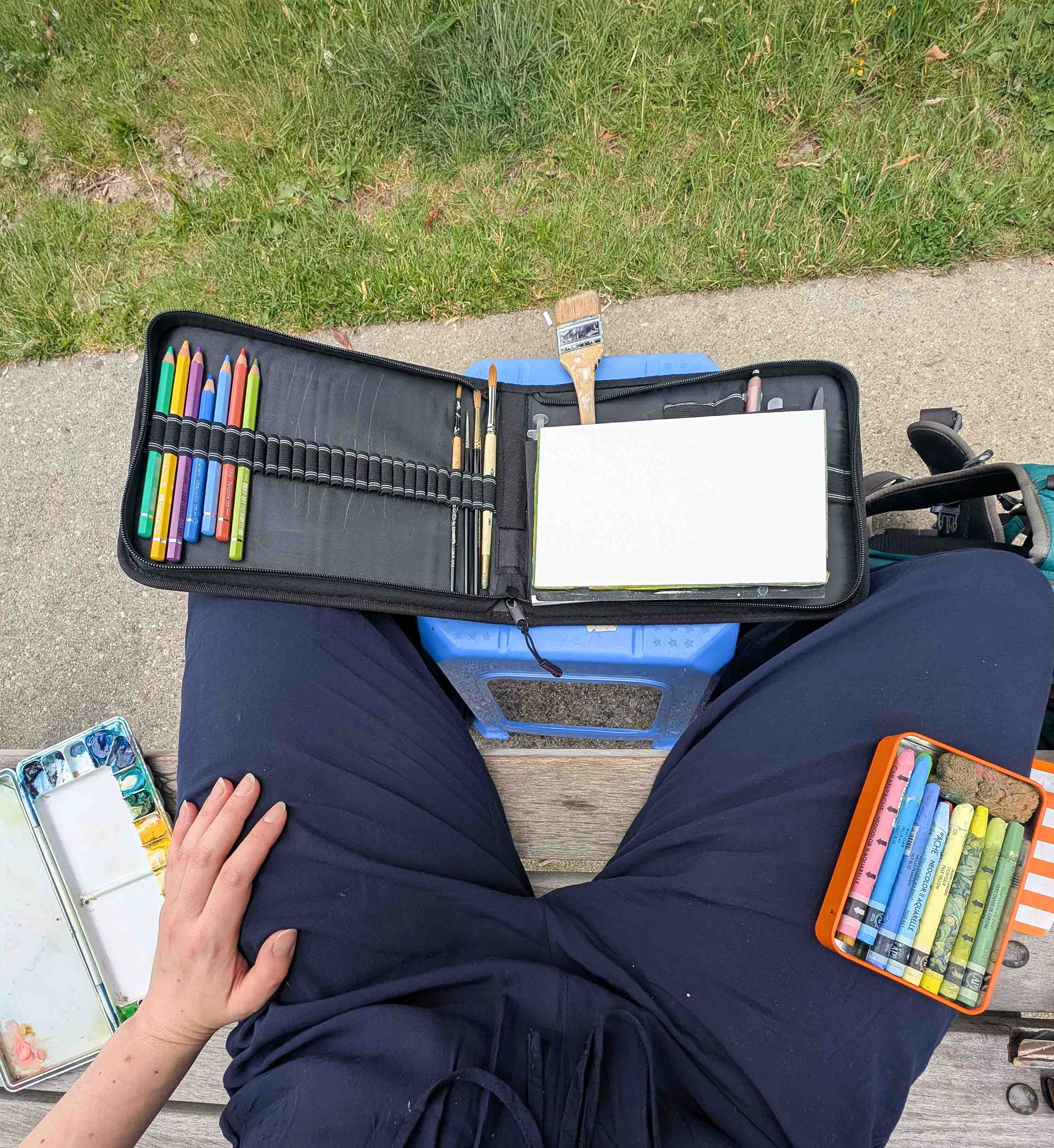
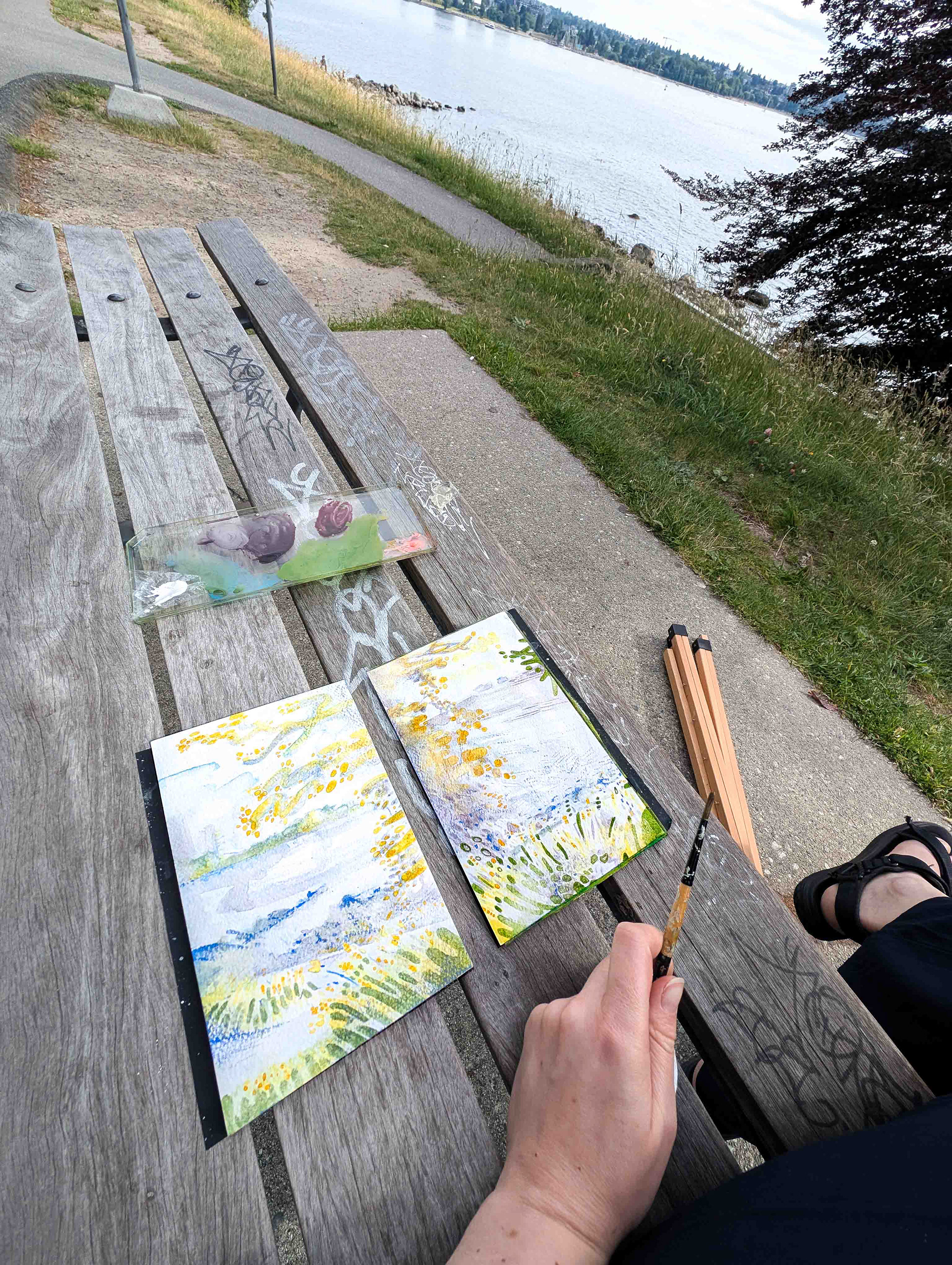
an overview of my setup, including my stool (table), paints, watercolour pencils and neocolour II pastels
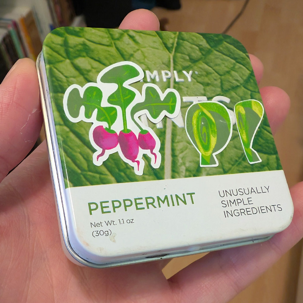
my mint-tin watercolour palette, closed. It features stickers of radishes brussel sprouts, from my kitchen objects sticker sheet.
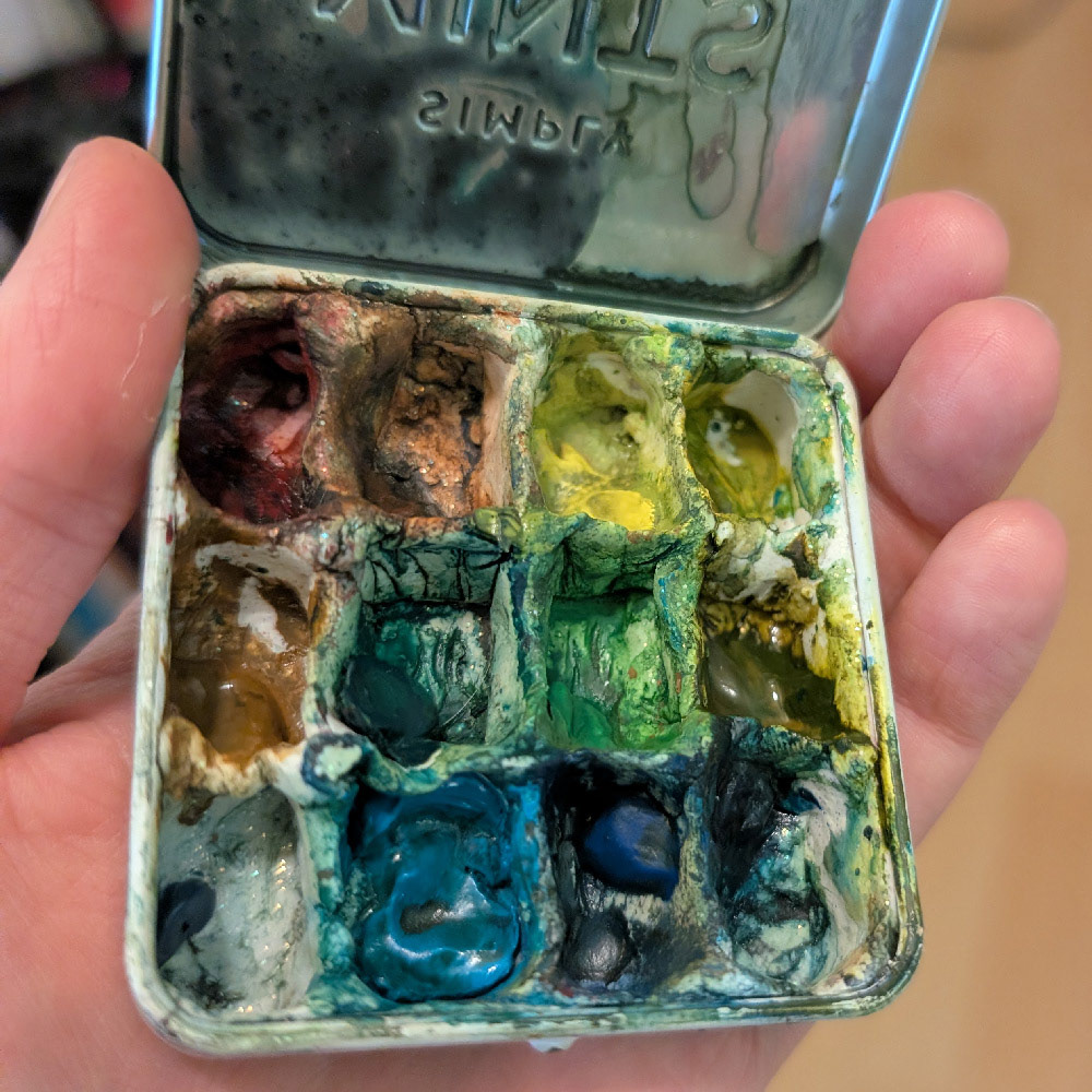
a shot inside my mint-tin watercolour palette. While ugly, the tin fits in my girl jeans front pocket. Here, I have a similar number of colours as my full palette, but with less mixing space.
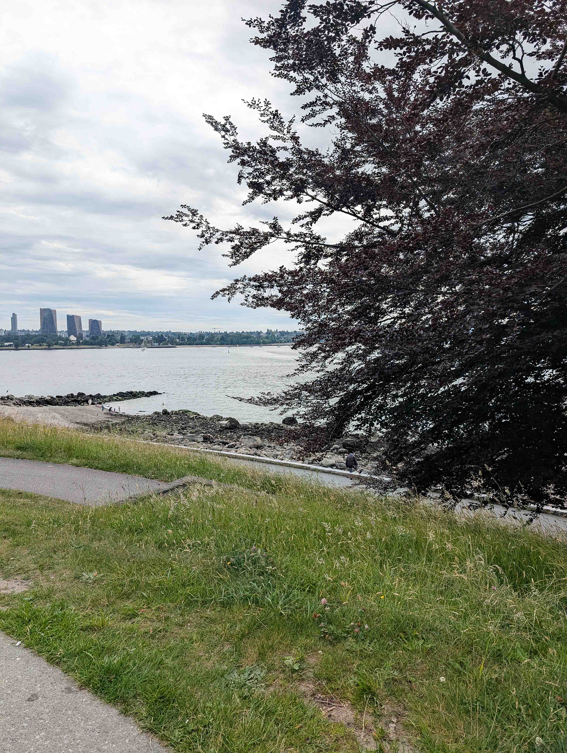
a photo of the left view, towards English Bay and across the water, featuring an outcropping of rocks in the distance.
getting into it
Take a picture of the angle(s) you want to capture, because the lighting will inevitably change. If you have these photos, you can touch-up paintings at home, or just show what you were going for.
Walk around a bit, and find a place that you think would really work.
adding the base
Make a light sketch on your paper (or even start with thumbnails) with something that’s light or easy to erase. I prefer to start with a complementary watercolour pencil, which washes out.
I apply water to bulk out the shapes that become the base of the painting. Here, I can start visualizing the shapes/movement and texture of the painting.
I apply water to bulk out the shapes that become the base of the painting. Here, I can start visualizing the shapes/movement and texture of the painting.
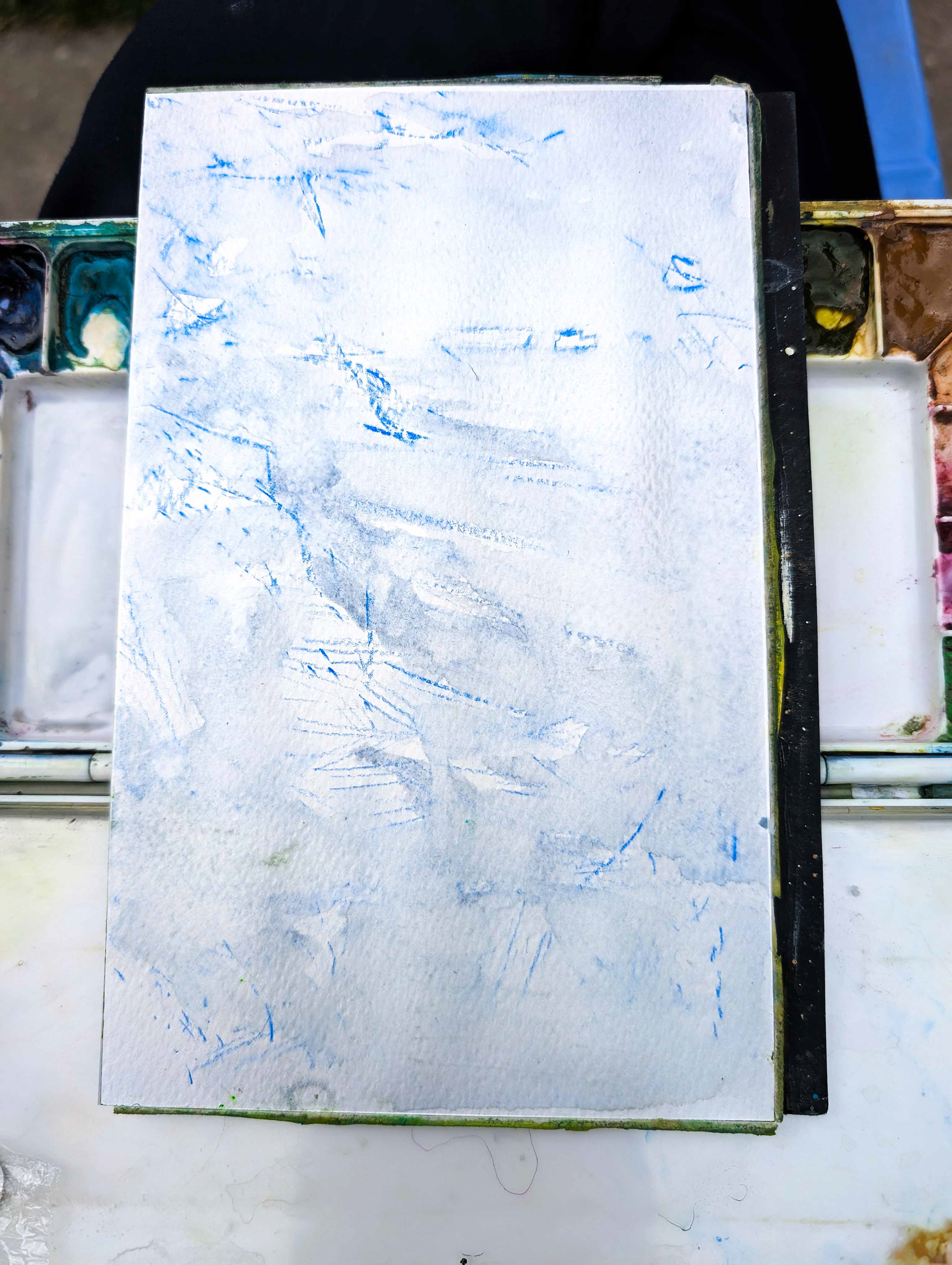
I continued here with a colour (purples) that became the base of the colour profile. The purple will neutralize and harmonize the rest of the colours. I chose it because, as far as I can see, it can be found throughout the scene that I am painting.
While I am painting light to dark, I am also choosing colours based on what % of the image it makes up.
So, after purple, I add blue. There is a lot of blue in the sky, water and in the far-off distance. I leave room for areas that I know will be lighter.
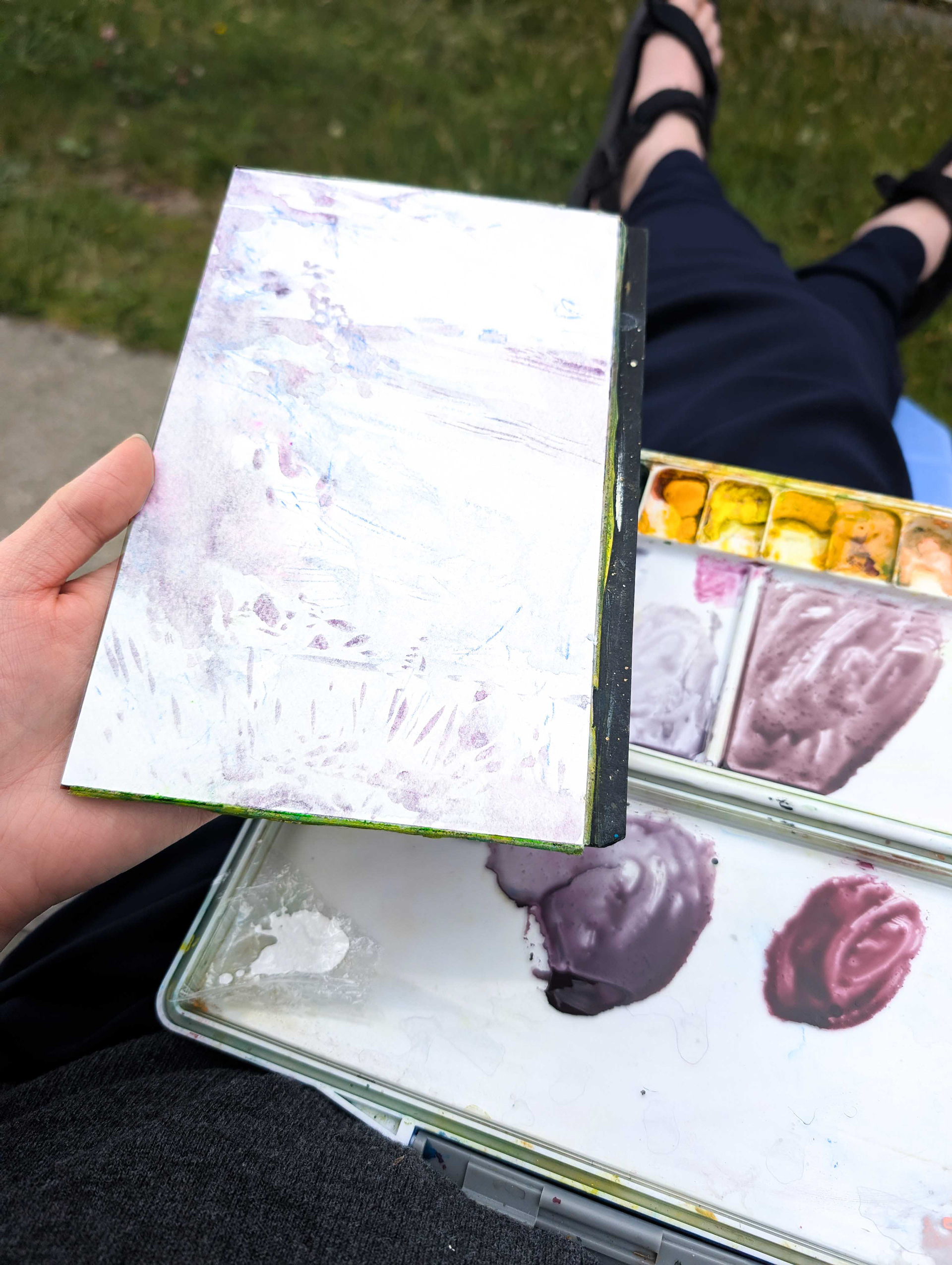
the first layers of colour added to my plein air painting
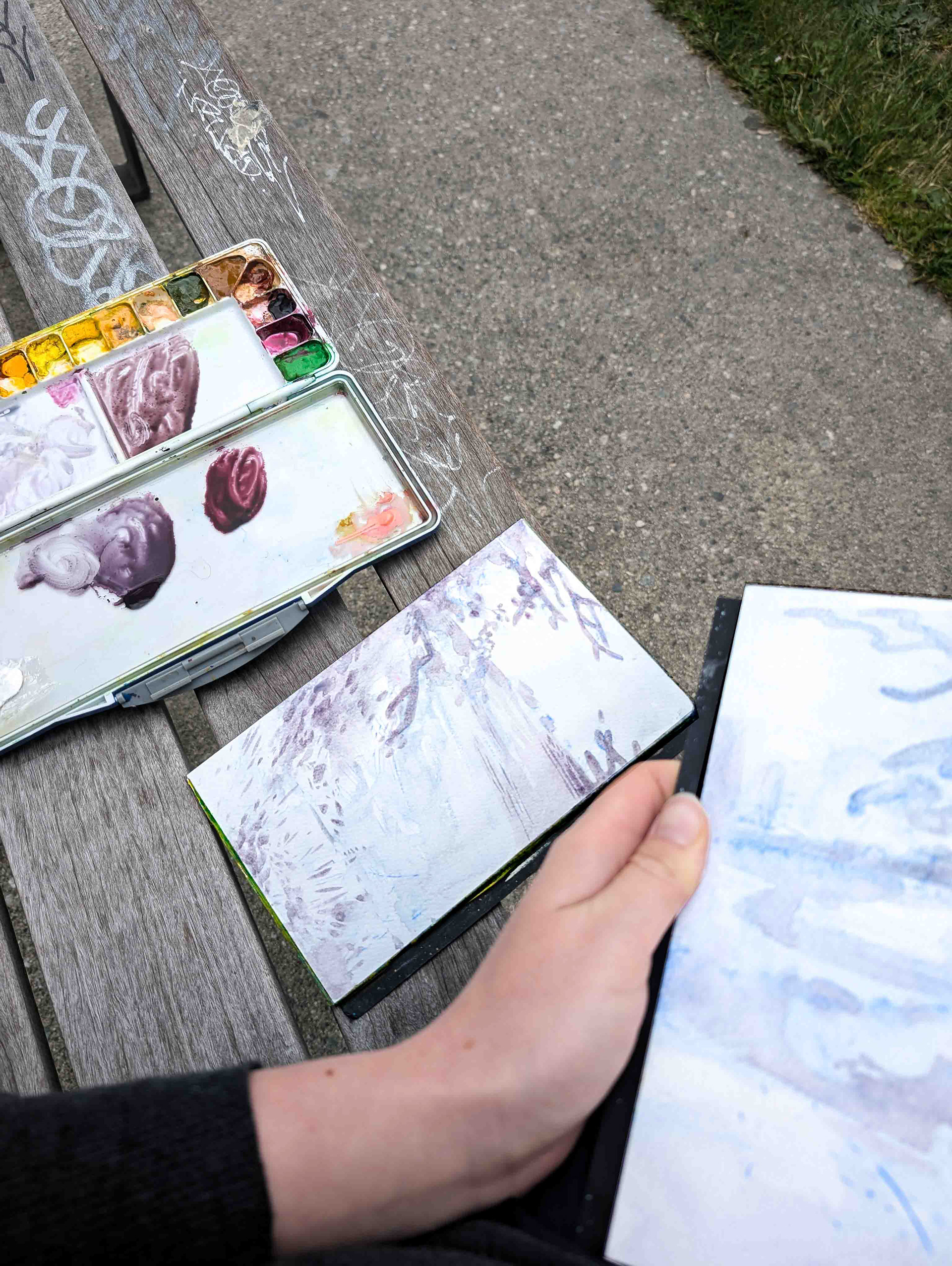
layers of darker purple and blue, to create shape definition
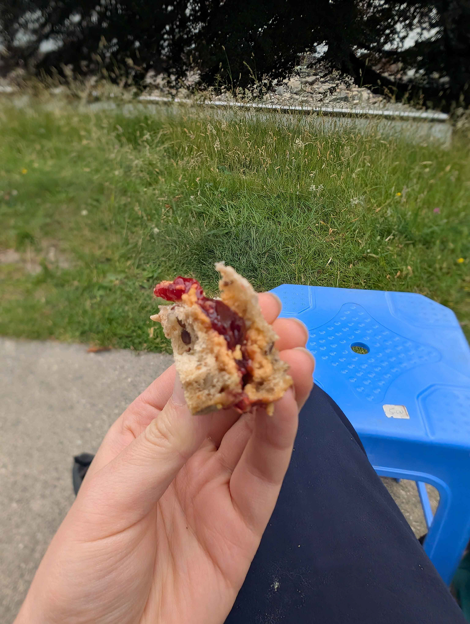
I have a snack break (note: plastic stool)
colour choices
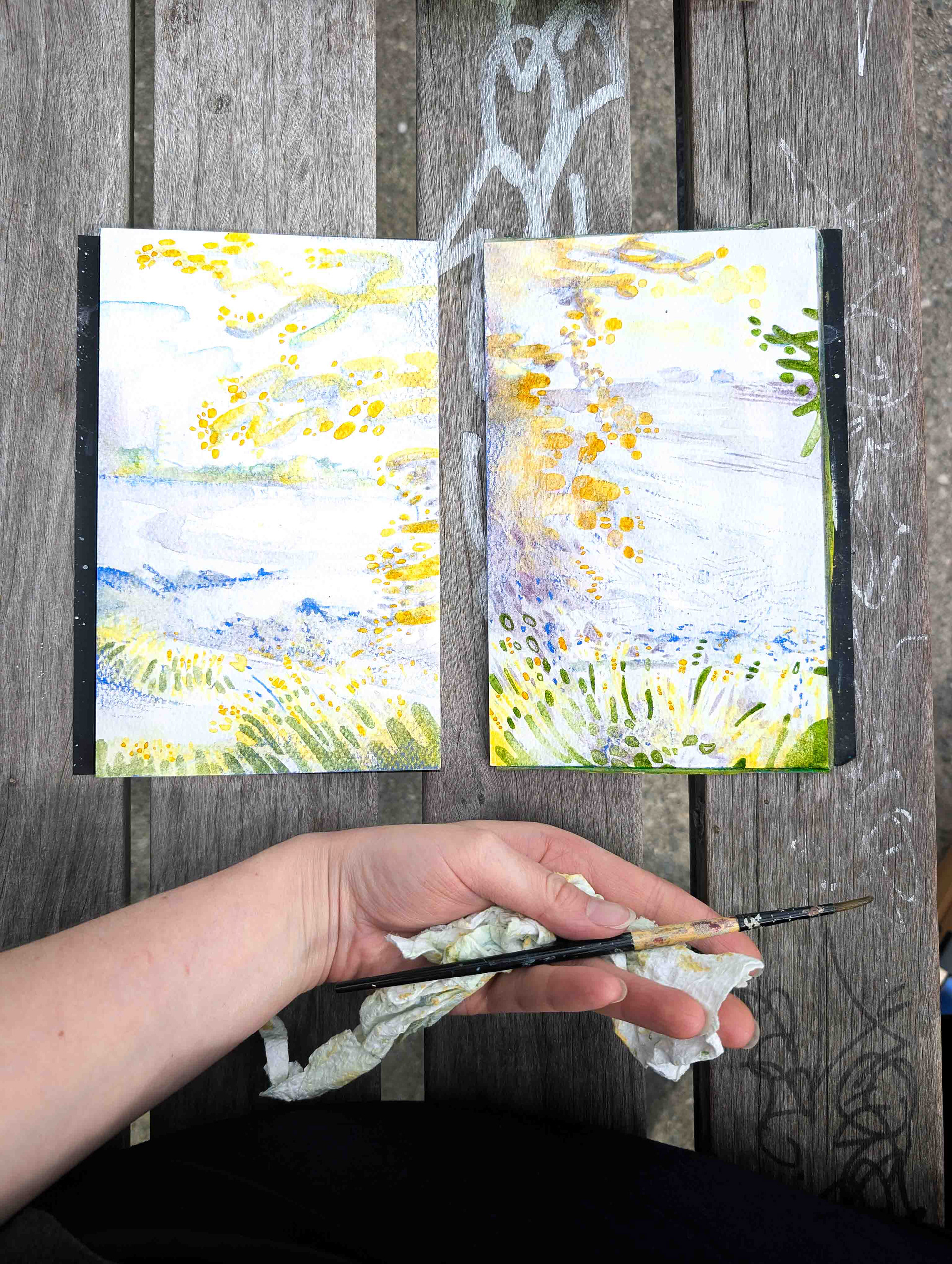
In some of these blank areas, I add brighter colours, like yellows and greens. While there is some blue at the bottom, it’s light enough to let the yellow be quite punchy.
I analyze the colours in the leaves (dark reddish-purple) but translate them into a range from yellow-orange-red to dark purple, instead. The dark foliage would add a lot of contrast and draw from the delicate transitions and textures I've created for the water and grass. Instead, I add the darker colours towards the ends of the leaves, where the higher contrast can draw attention to either focal point.
adding the bits
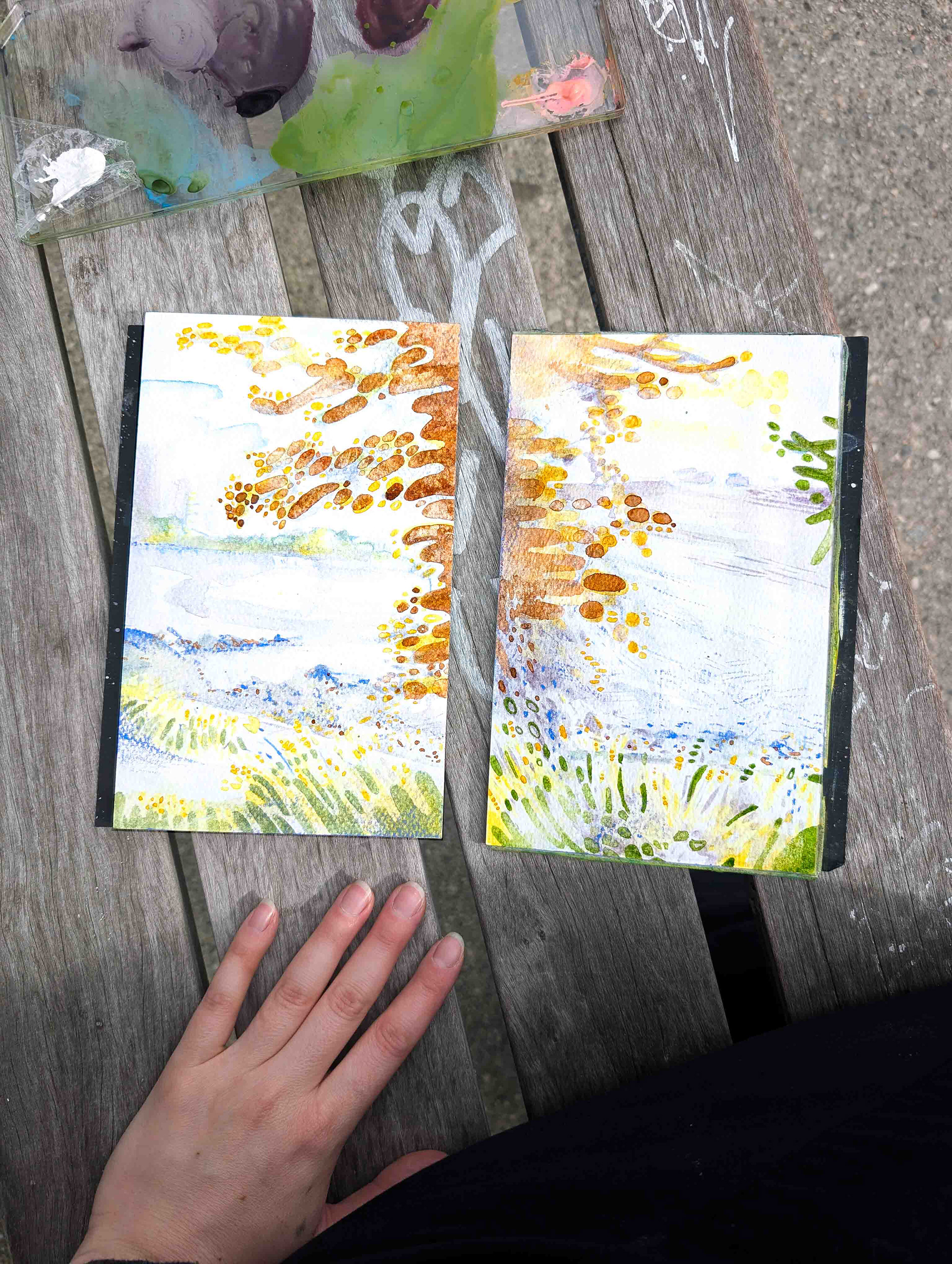
Here is where you can apply watercolour pencils, Neocolour II pastels or any other media on top, to create whatever textures that aren’t feasible without an unfeasible amount of watercolour layers.
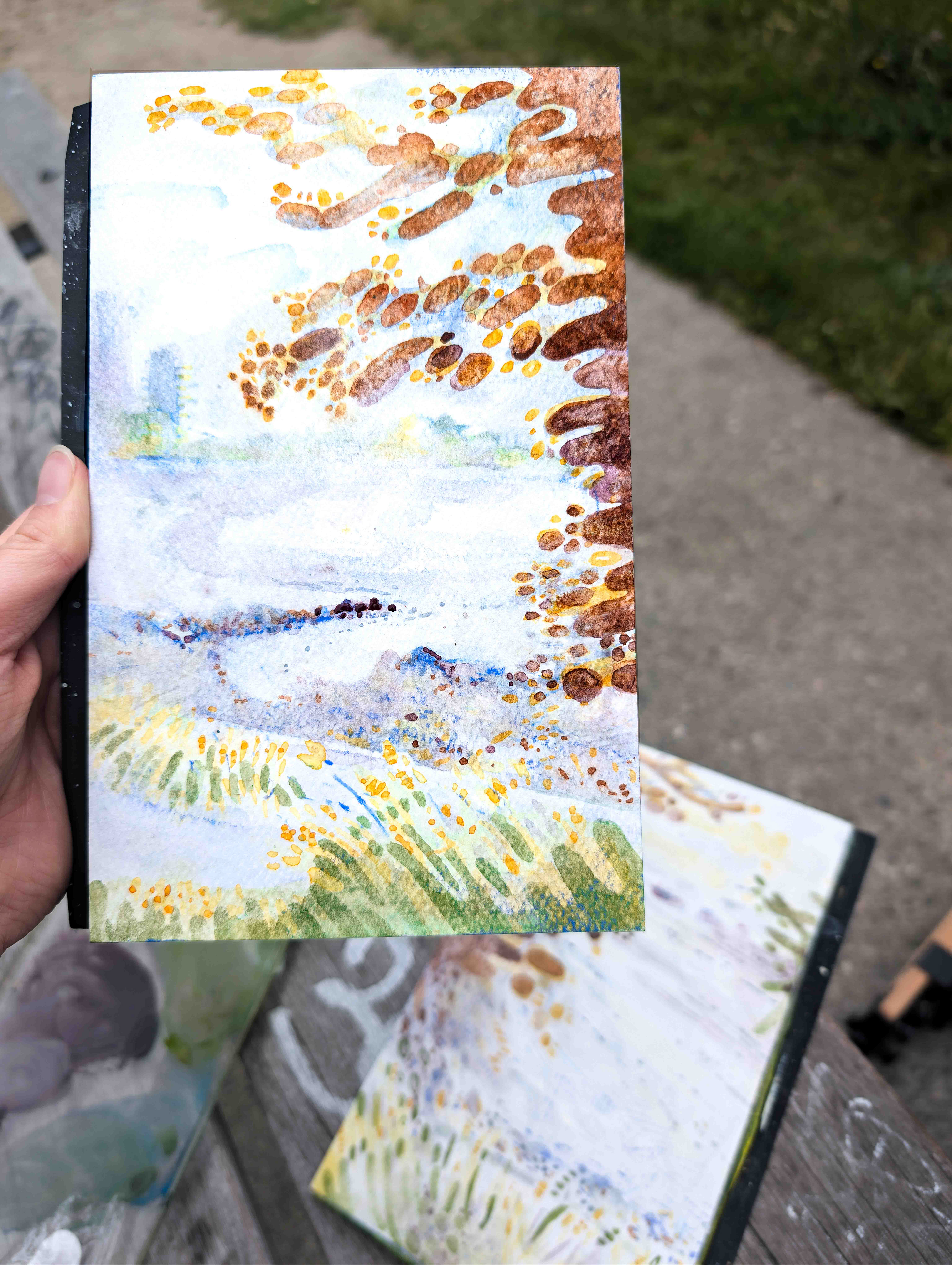
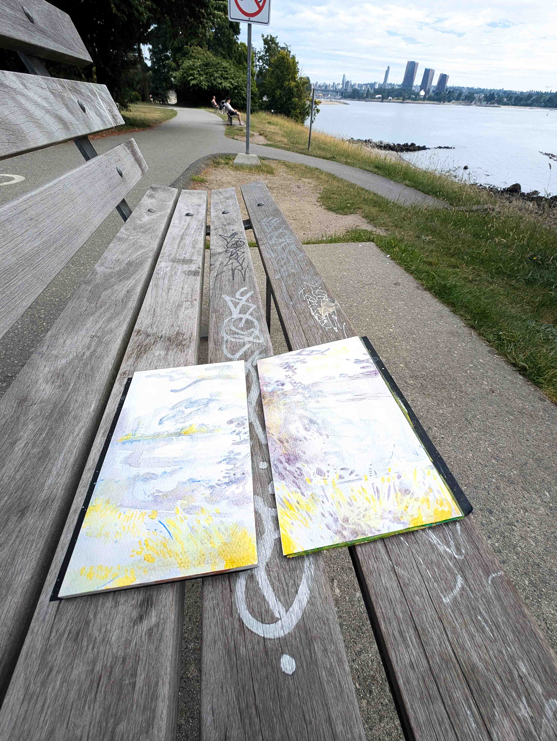
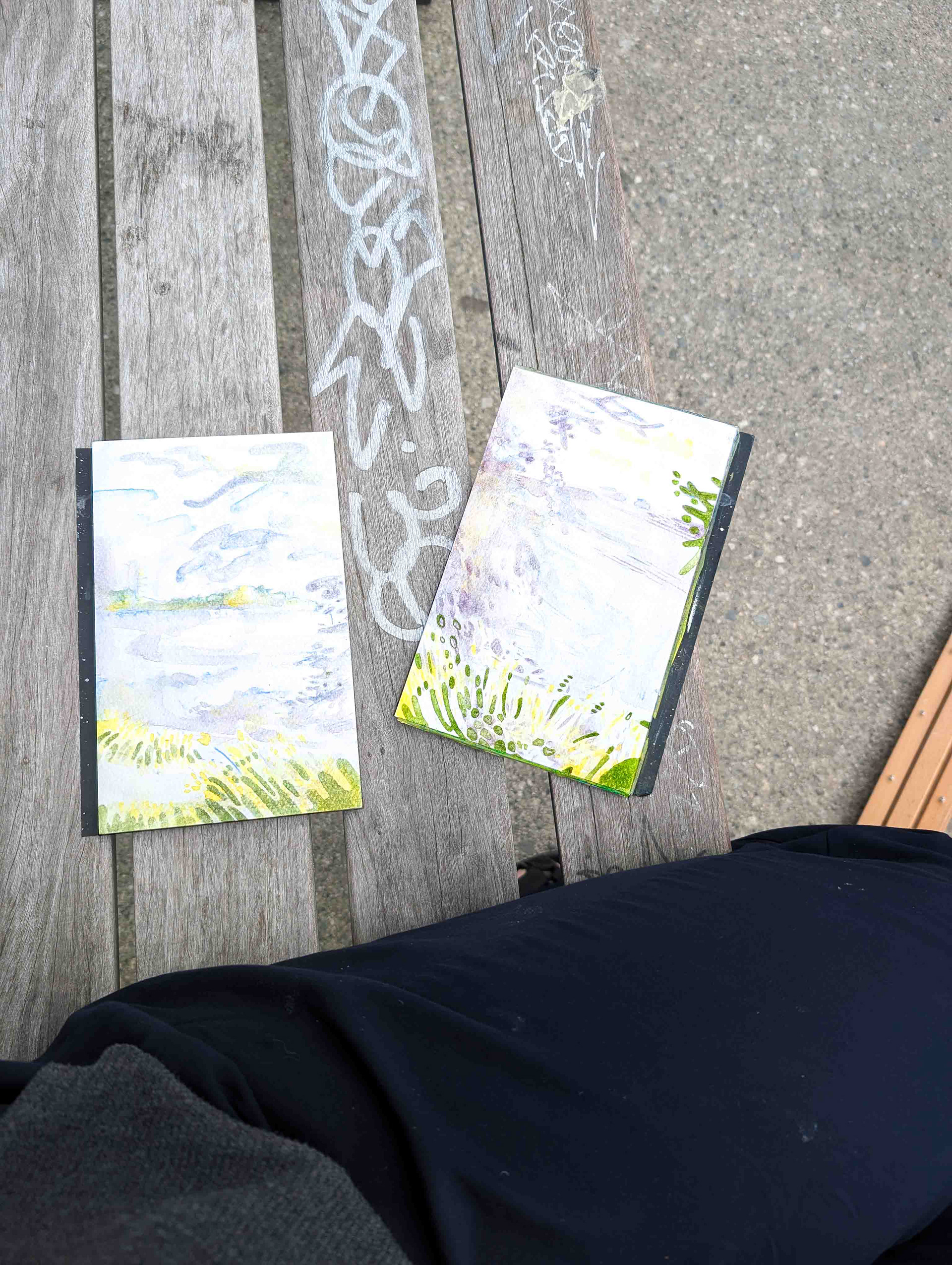
one of two plein air watercolours of english bay, featuring bits
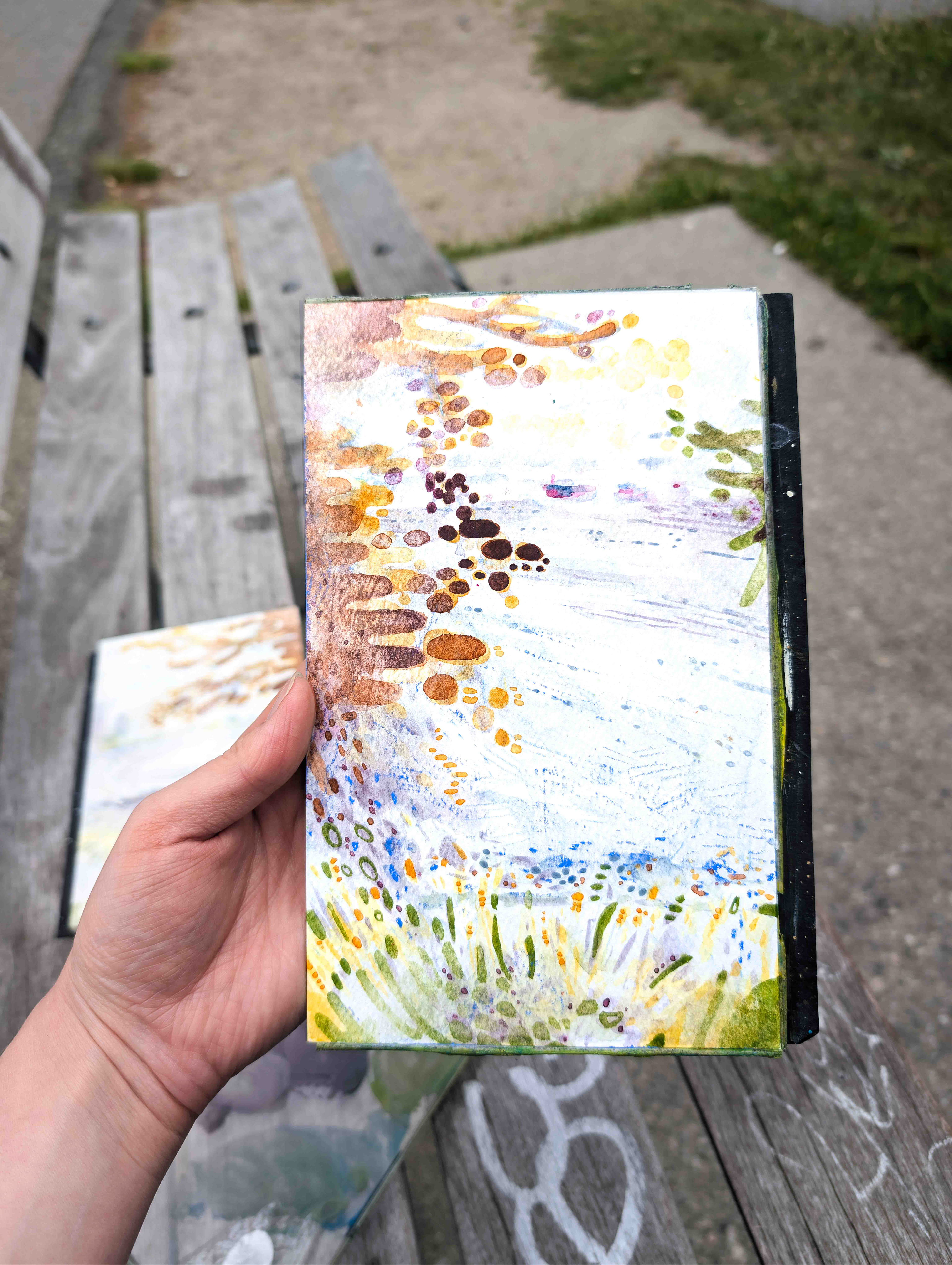
one of two plein air watercolours of english bay, featuring bits
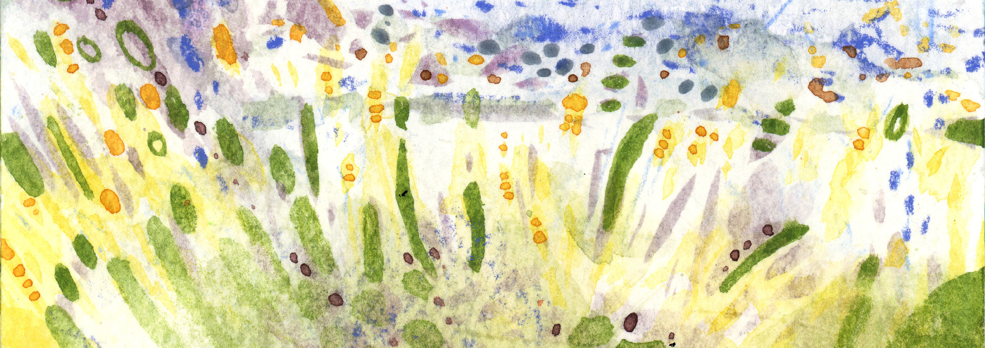
a closeup where the distant shoreline meets the foreground grass, from the one of two paintings of English Bay, Vancouver, en plein air, July 2026.

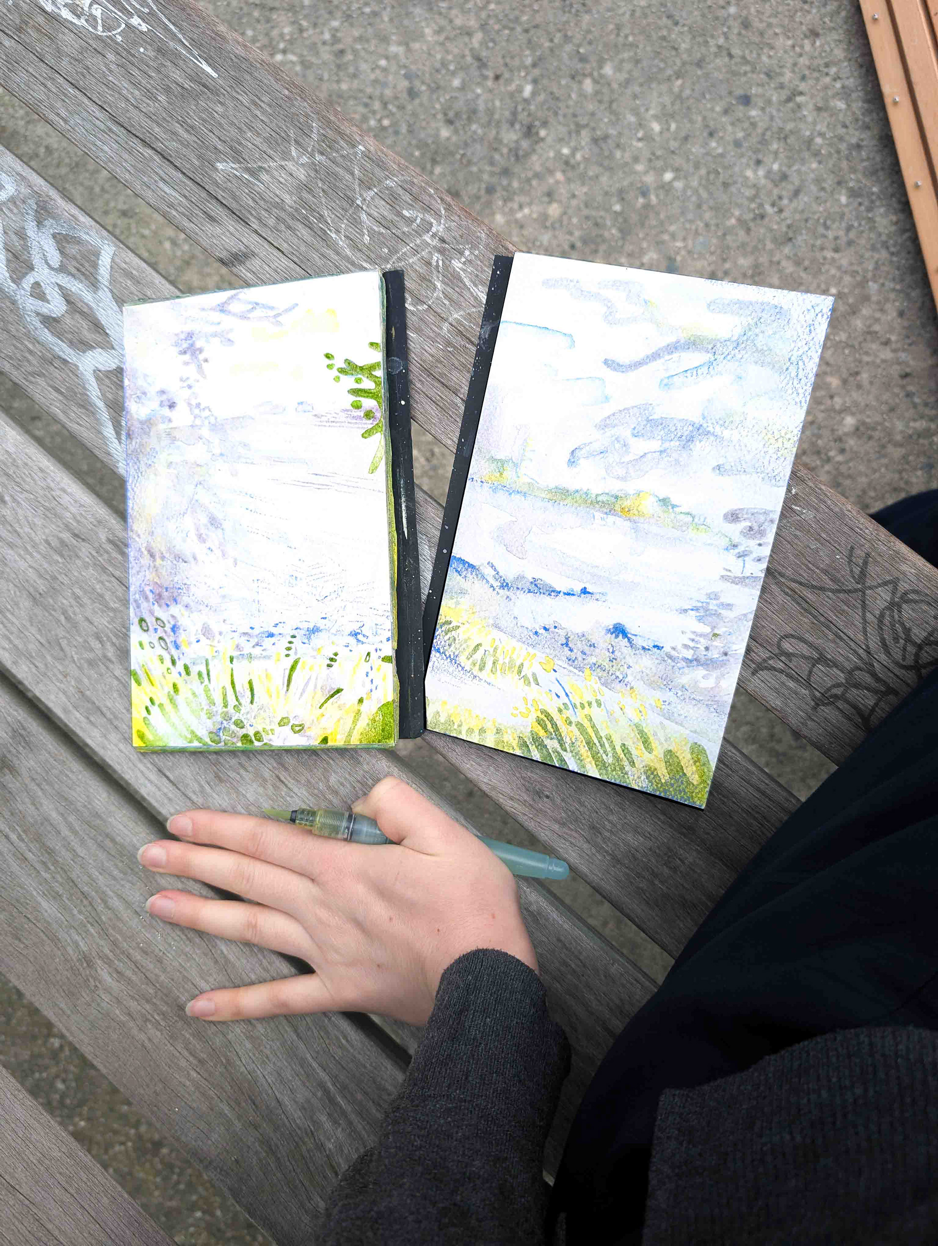
a closeup showing the colours being brought together, in the left watercolour painting en plein air at English Bay, July 2026.

a closeup showing the colours being brought together, in the right watercolour painting en plein air at English Bay, July 2026.
unifying the composition
It's good advice to try and use colours throughout your composition, so I like to drag colours over rough paper to do so. In the examples here, I've used a blue or purplish blue watercolour pencil to darken the edge of the plein air painting and to bring the colours together.
I applied the colour more opaquely in the right painting, because the foliage was lighter on the right. This served to correct the values, as well. To add, the left painting had less of the blue-violet hue, and could stand without added colour.
be done with it
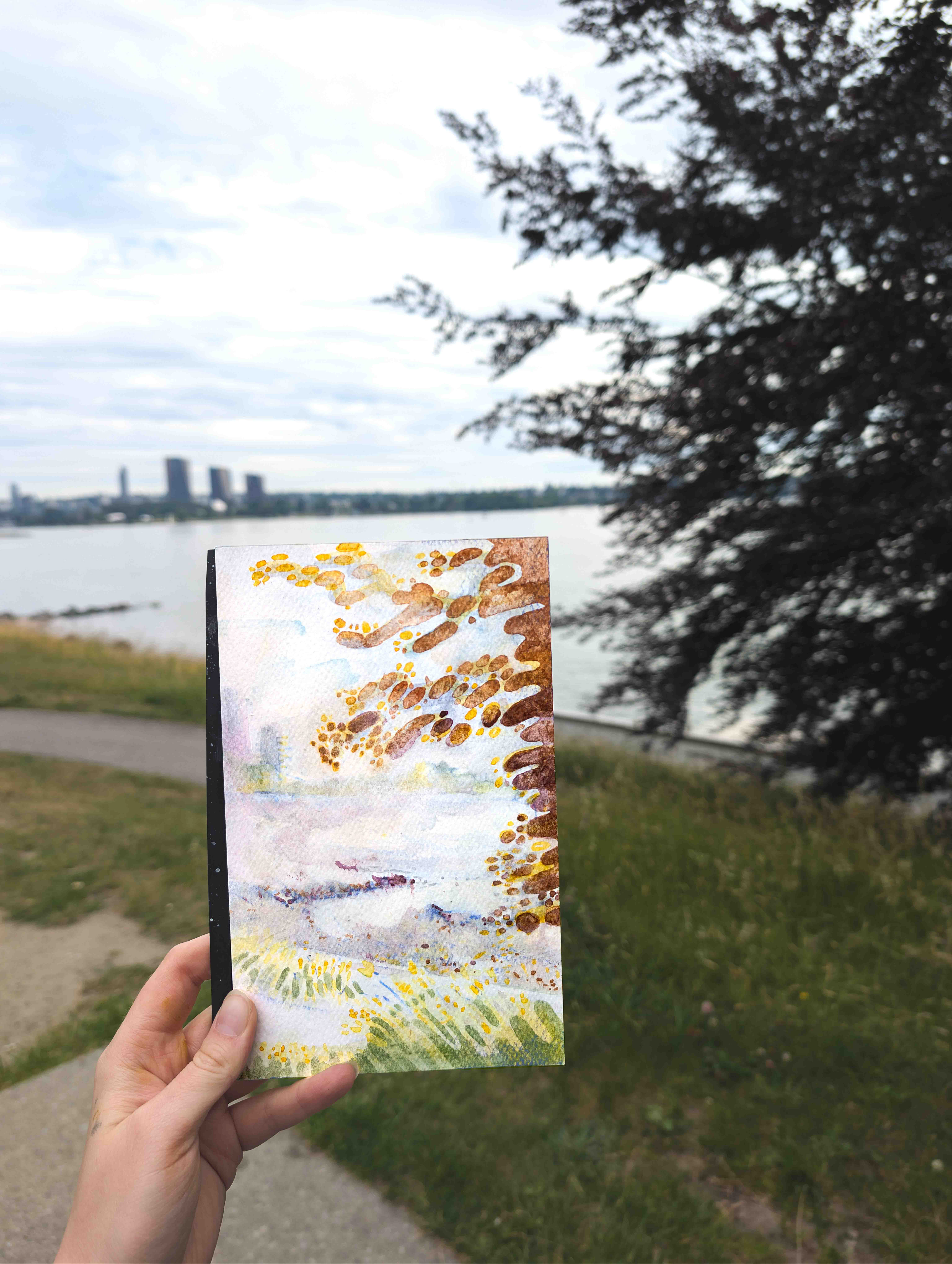
one of two paintings of English Bay, Vancouver. Watercolour en plein air
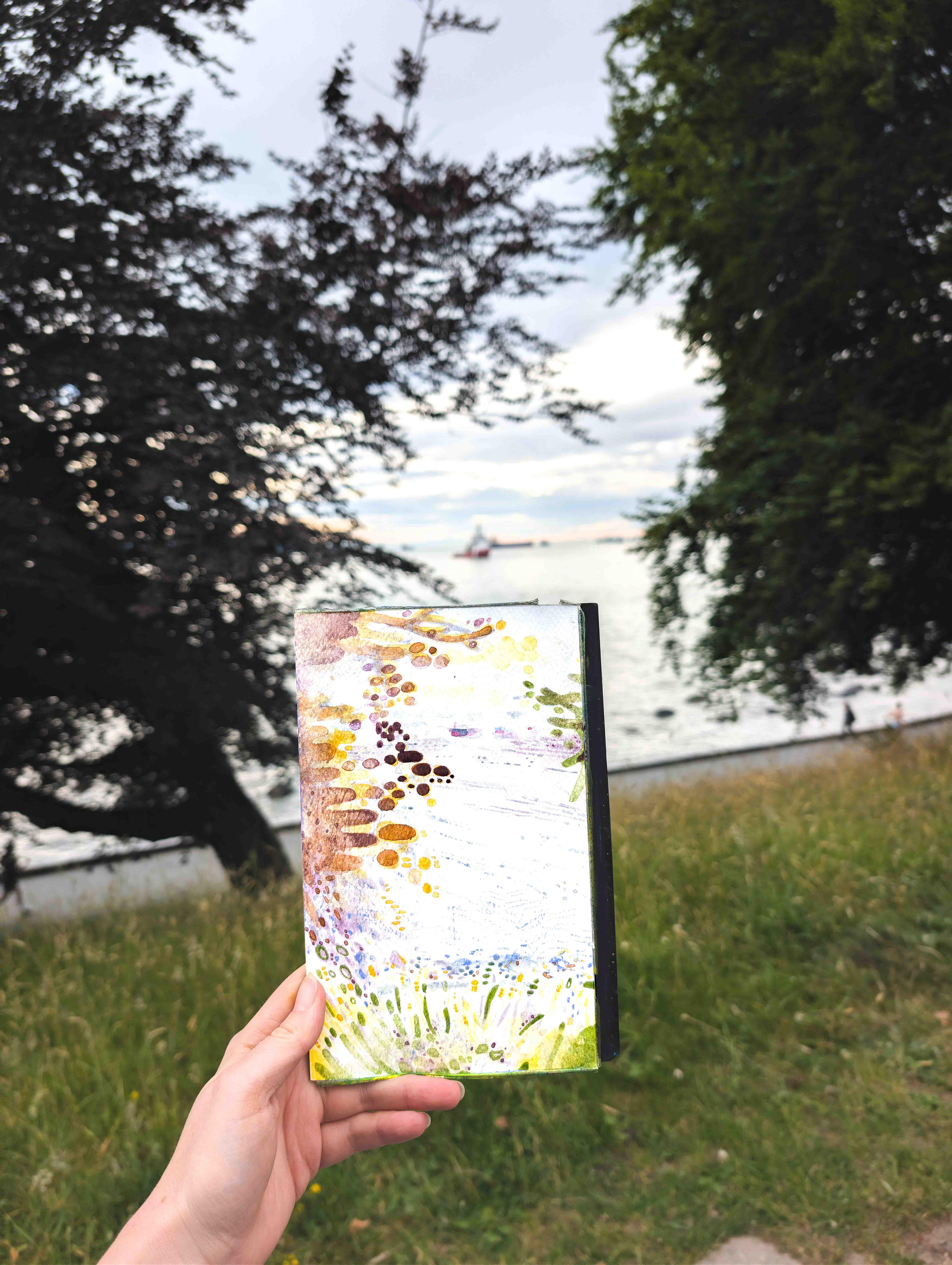
one of two paintings of English Bay, Vancouver. Watercolour en plein air
When you wake up from your multi-hour stupor and realize that it's getting cold and dark, call it at that. You can always touch up at home, as many famous painters have done for forever. It's not cheating. Take a picture, collect the sprawl of stuff you brought out painting with you, and onto your next adventure.
Thanks for coming along for mine!