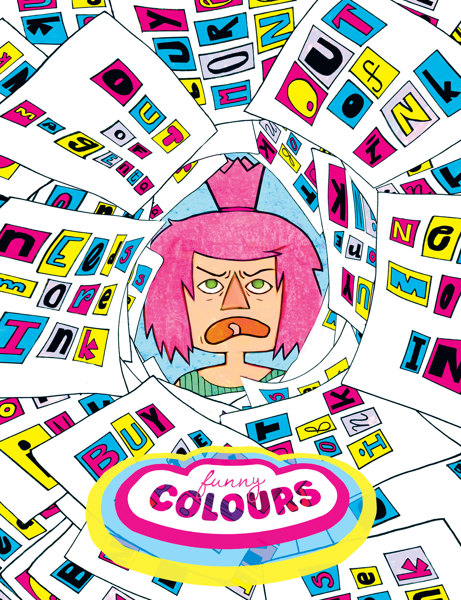
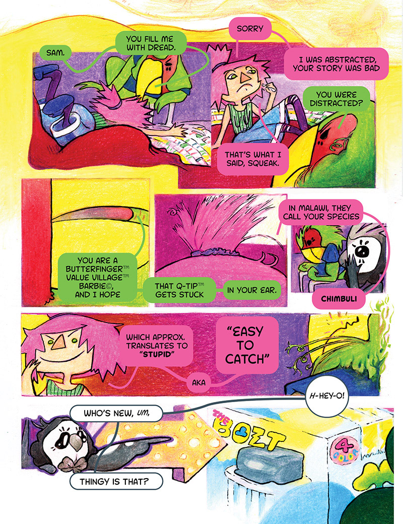
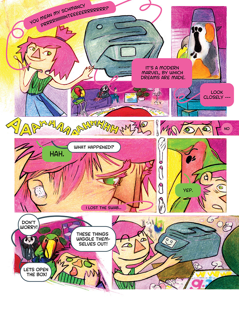
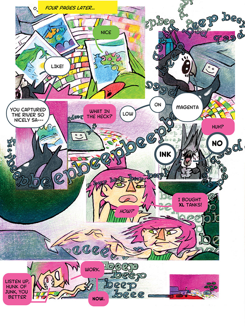
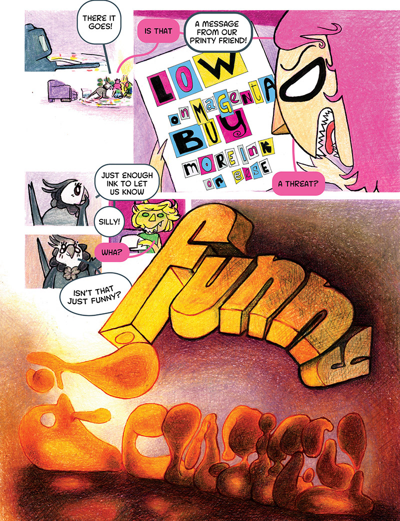
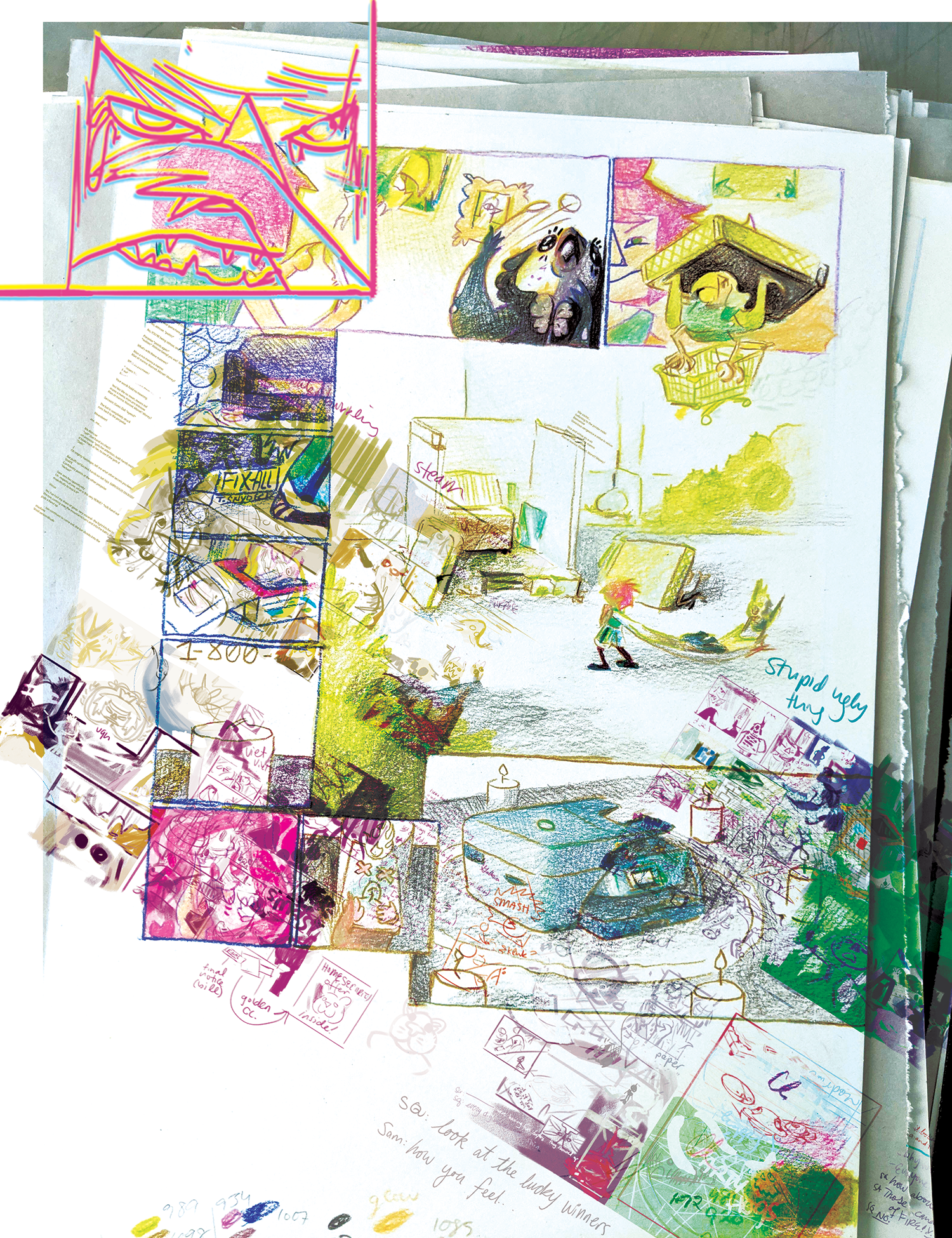
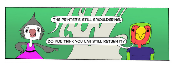
A short comic featuring an agitated and confused artist, who takes advice from strange adults in a lightly dystopian, largely everyday rant about printer ink prices.
I found a lot of gusto from our annual smokening, a newly annual event in British Columbia and many other parts of the east coast, where the skies churn and the sun explodes in salmon pink. I take photos each year.
This is my *~*_*~*__satirical__*~*_*~* combination of people, places and things not intended to reference or call out any specific person, persons, persons sons or company.
(Could you imagine how long that comic would get? I don't know that I'd even read that.)
(Could you imagine how long that comic would get? I don't know that I'd even read that.)
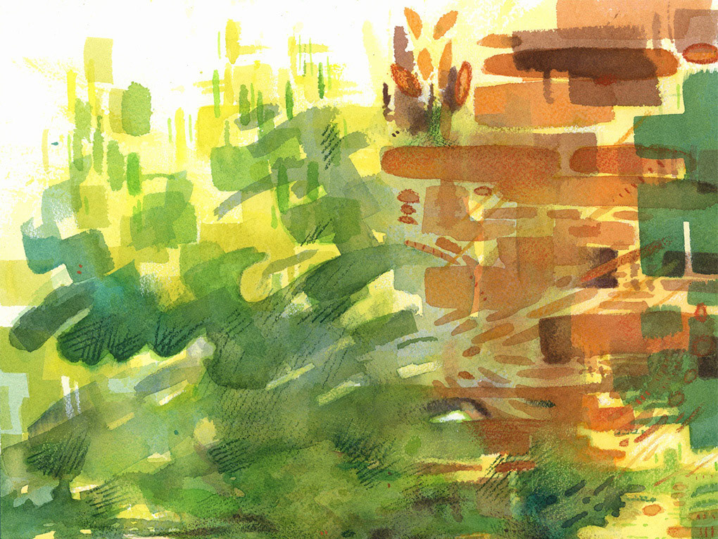
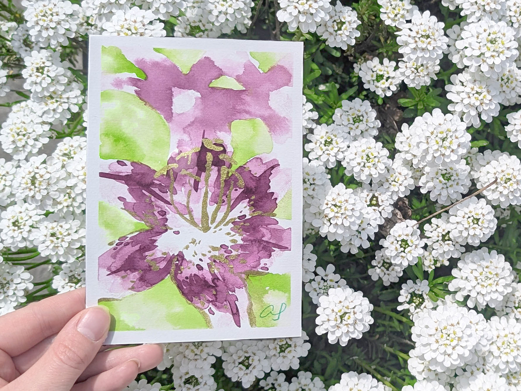
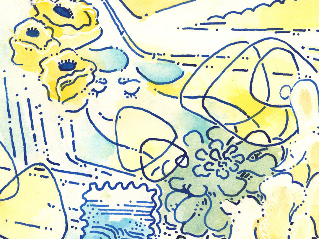
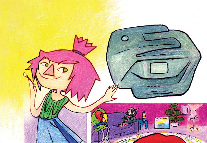
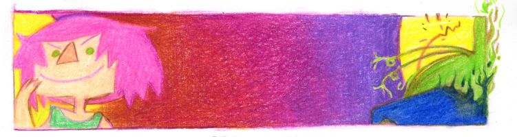
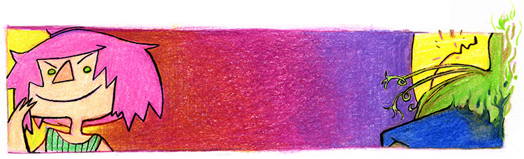
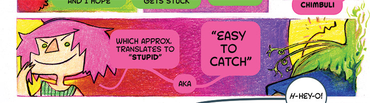
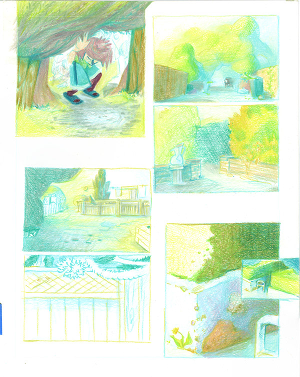
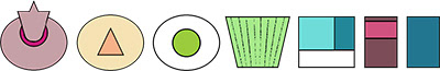
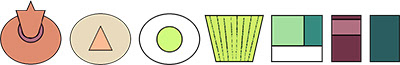
the sample pages
Back cover page, featuring sketches from the rest of the graphic novel.
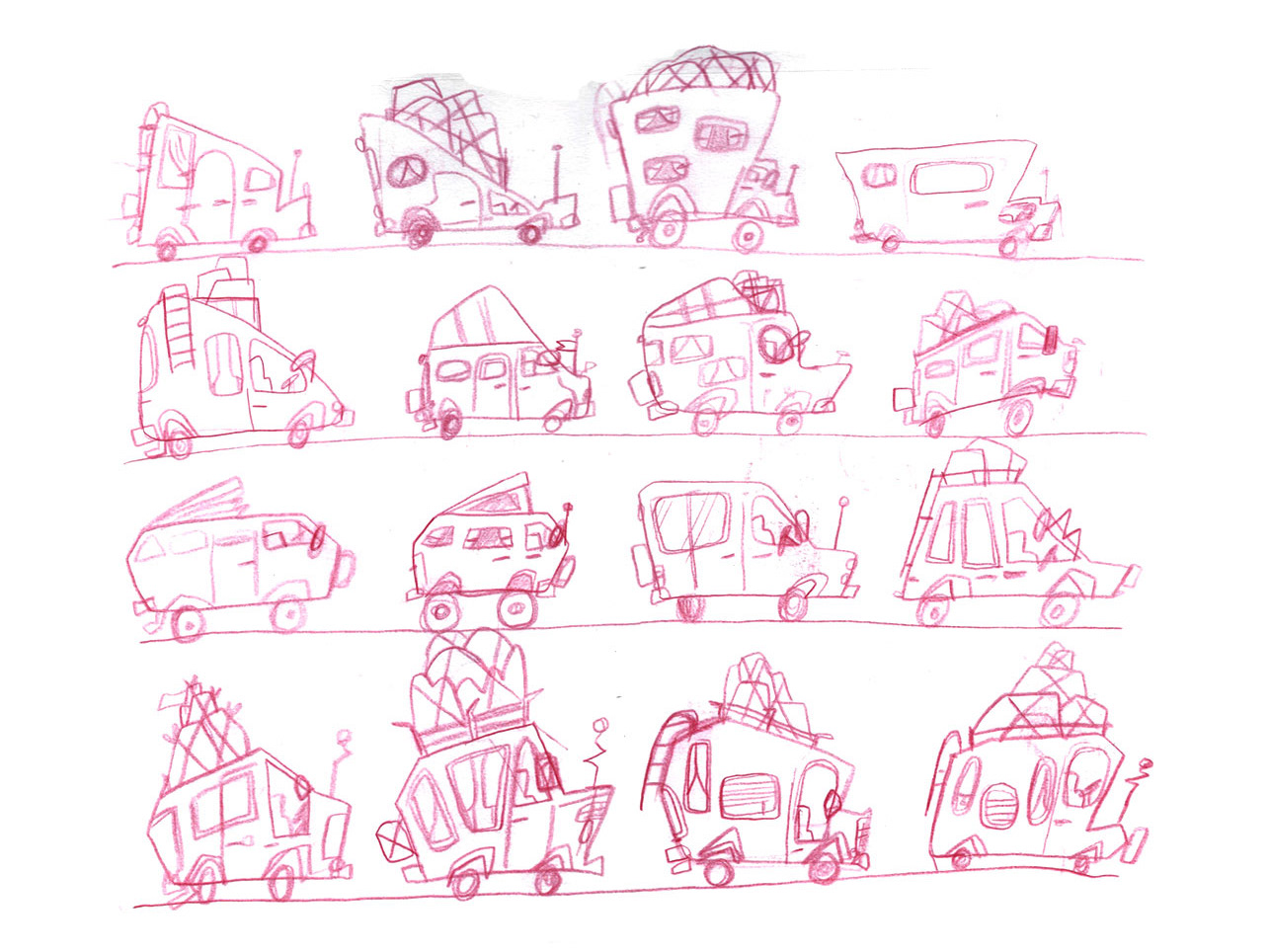
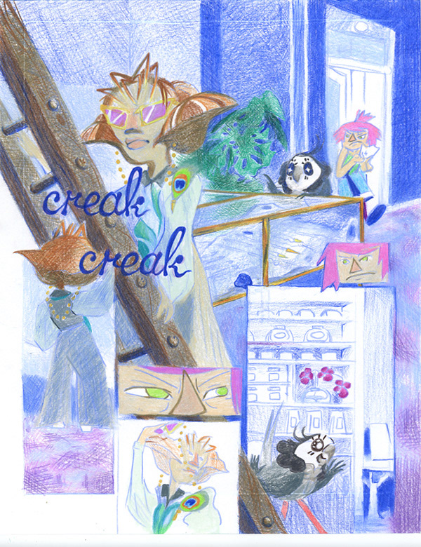
the process
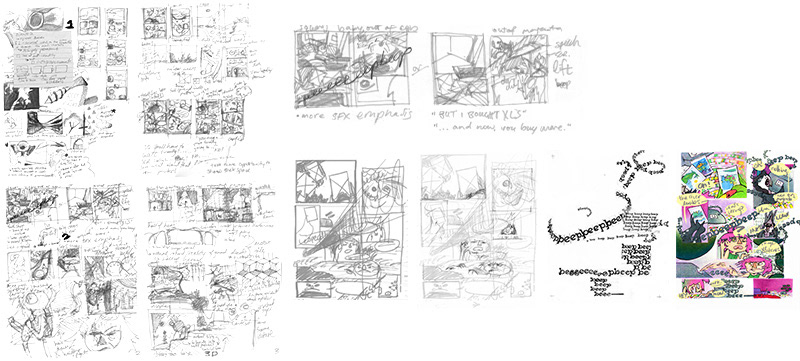
A screen showing my process from ideas to thumbnails, larger sketches, and tracing paper lettering into the final page.
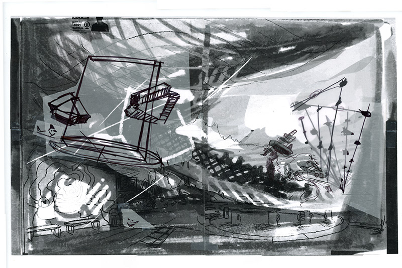
A full spread sketch featuring drones and airplanes along the Vancouver coastline.
Character Turnaround Sheets
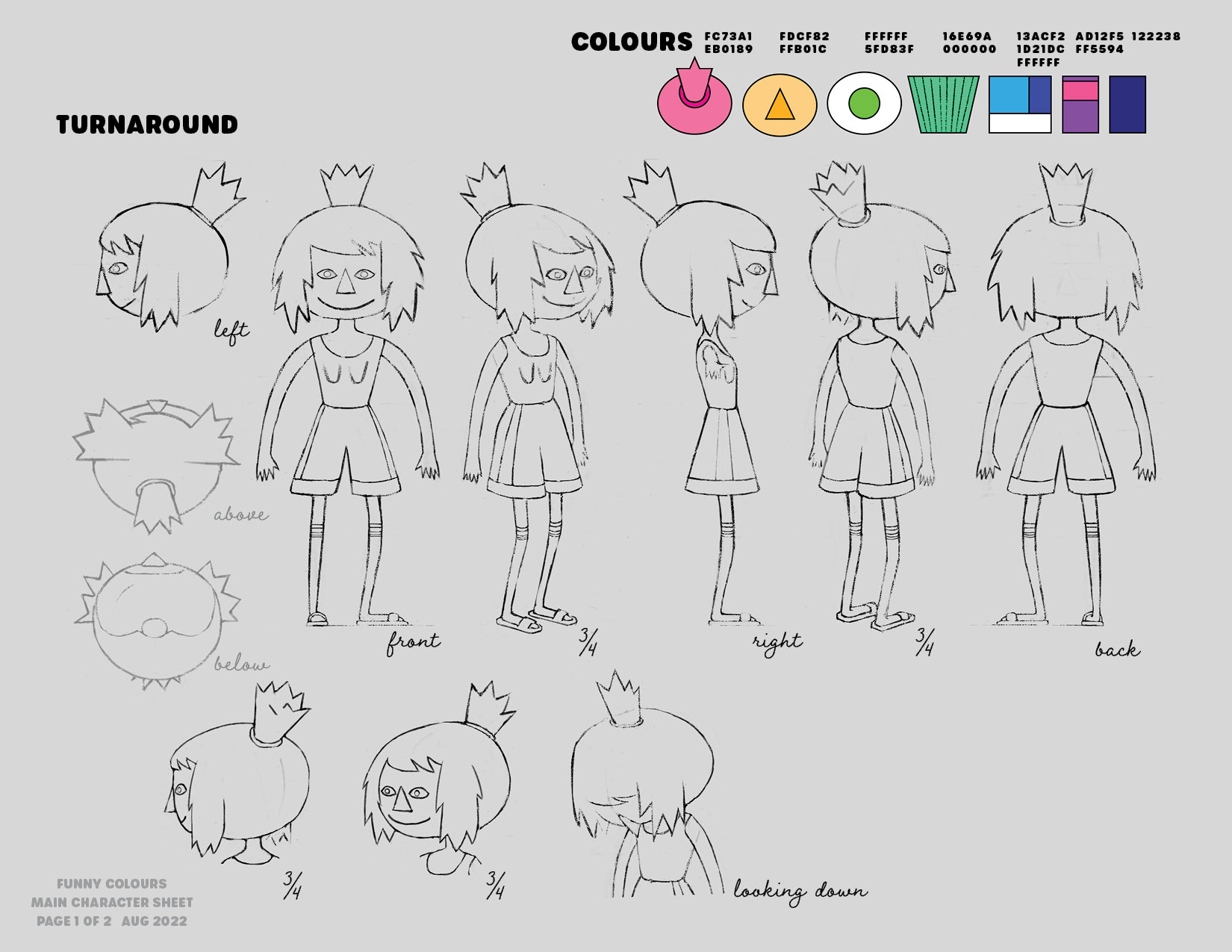
The full turn around for the main character.
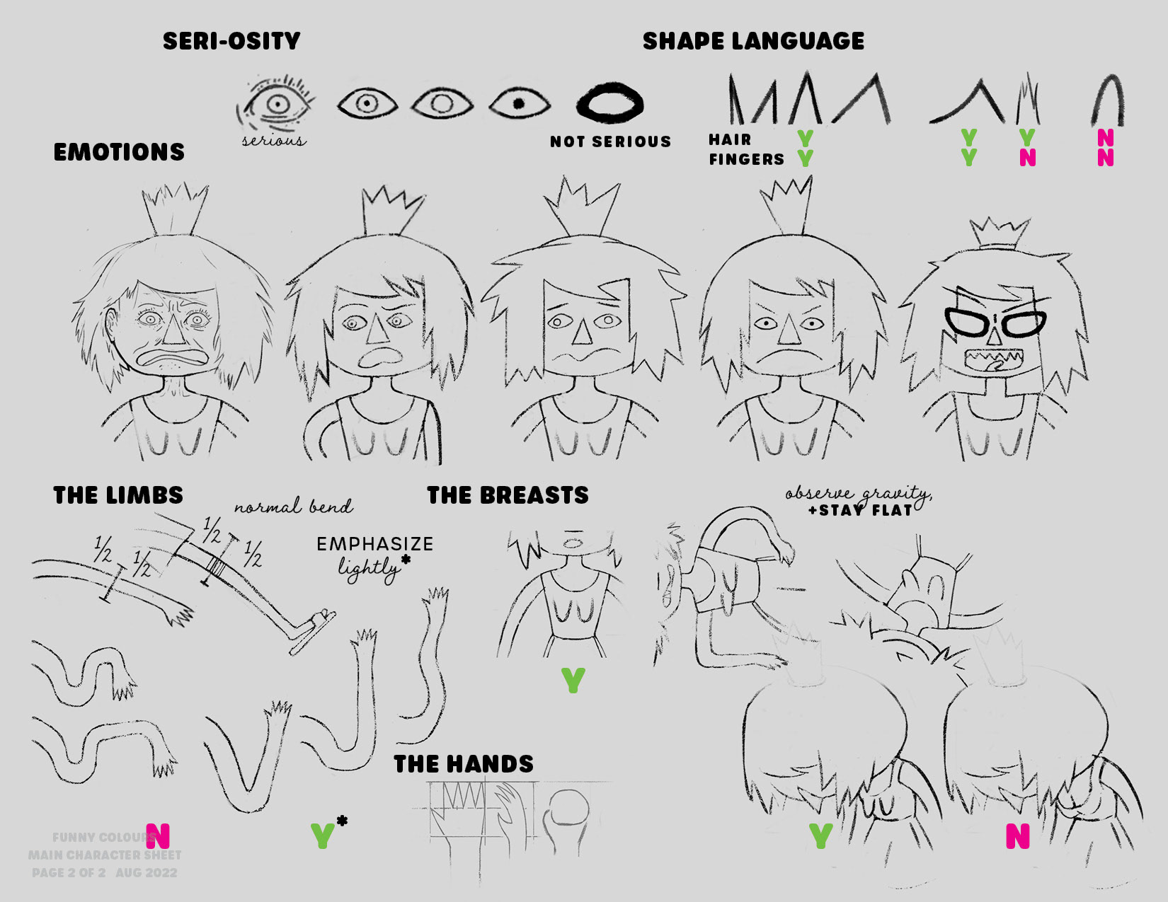
Different facial and limb movements for the main character. These rules play an important part in keeping everything together, page by page.
On the previous character sheets, I outlined how the limbs, breasts and hair are used to accentuate gravity, movement and expression. Through the pages, I use the character's body as it's own shape language for diving and drawing attention across the panels and pages.
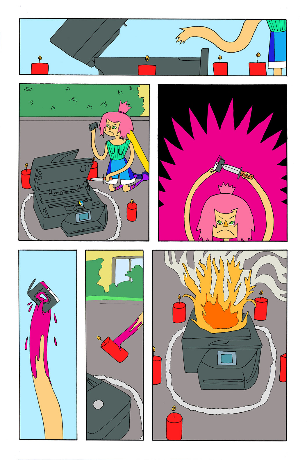
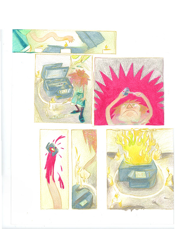
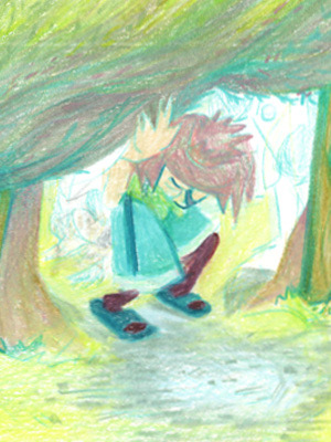
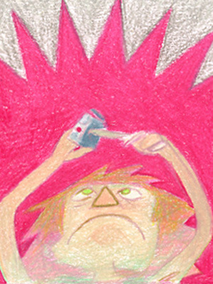
Page X – A wordless page depicts our heroine piercing the bloody, beating heart of her enemy, the at-home printer.
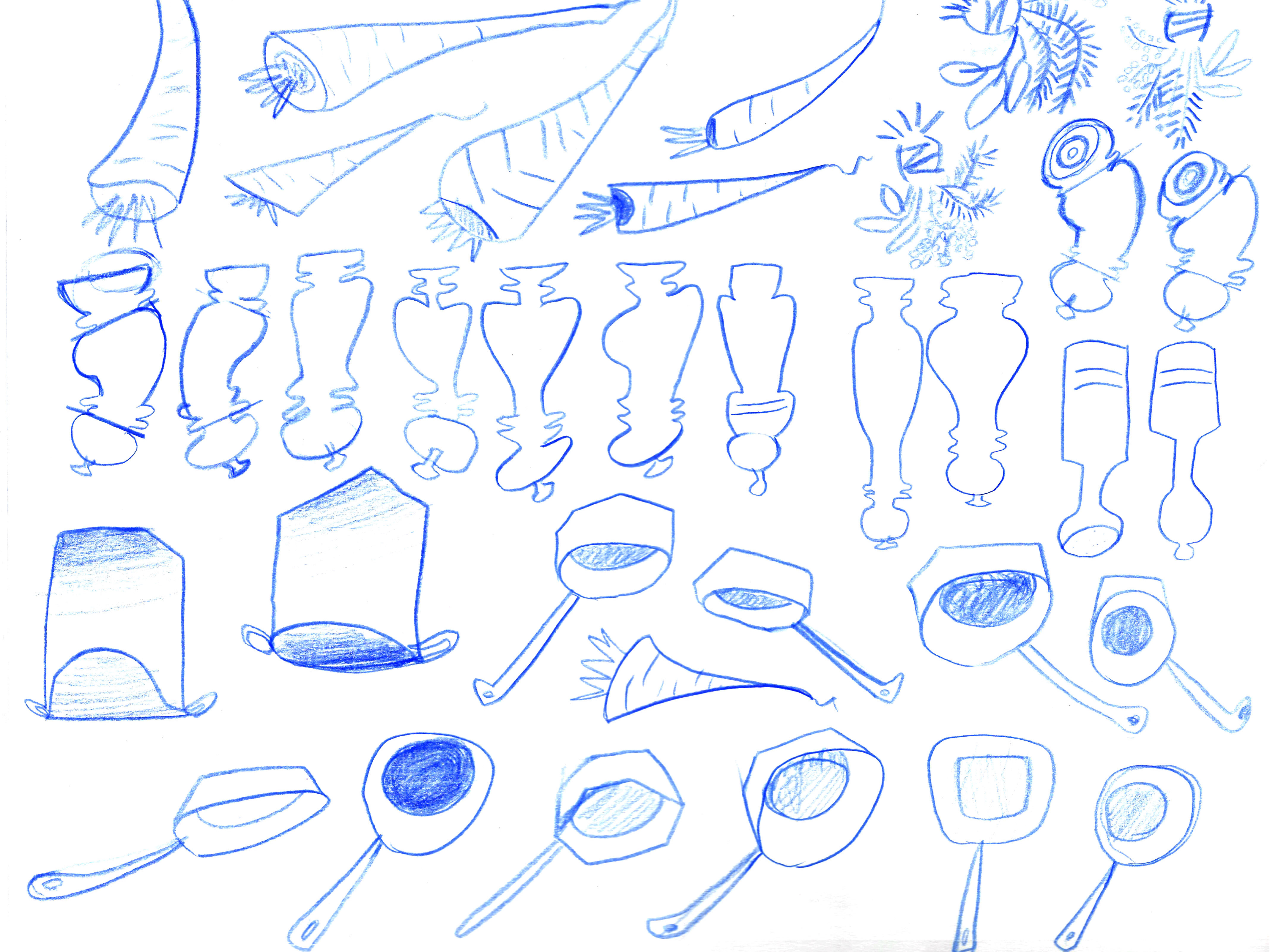
pencil crayon rendering process
Pencil crayon colour is built up layer by layer through crosshatching, and then it's burnished using a blending or white pencil crayon, to smooth it out. The last step really brings out the saturation and makes the page "pop."
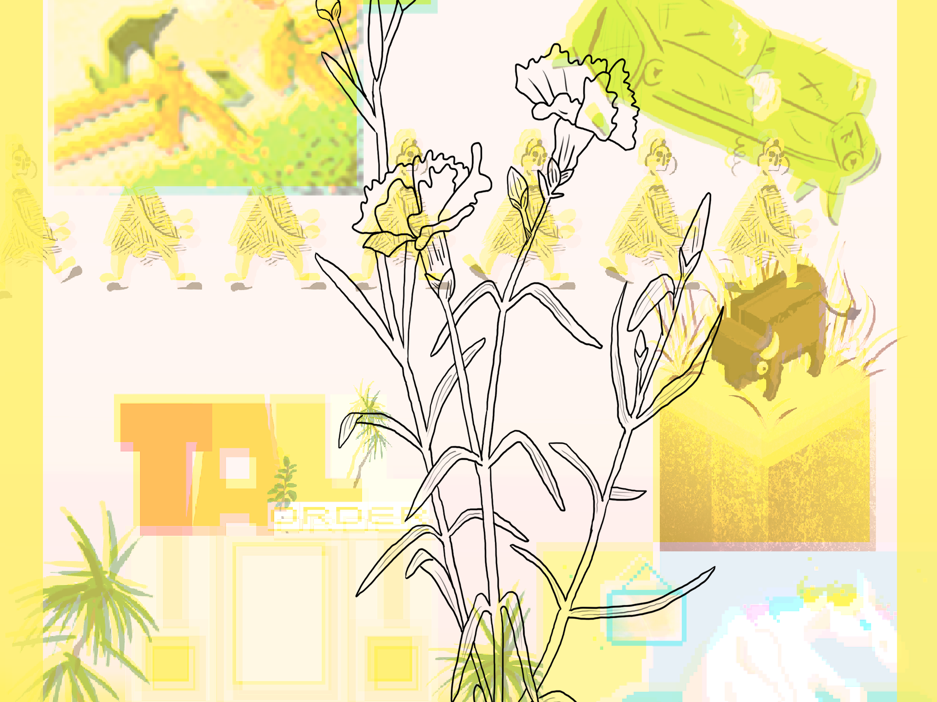
colour scheme variations, Work In progress

The comic has been divided into different colour schemes according to its mood and setting. The base colours for the characters have been shifted according to this, and are shown, with their shift, in a graphic at the bottom of each section.
The colour of the scene change shift depends on the colour of light coming through. Below I have red green and blue light, which I use while colouring.

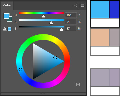
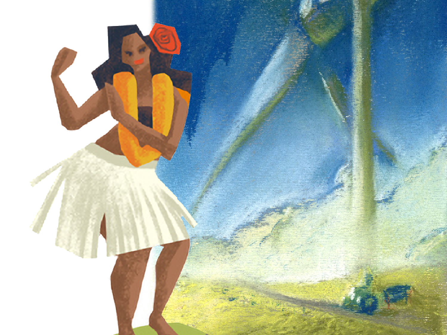
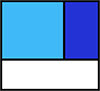
Starting with a blue object in standard Full Cartoon lighting.

Adding an orange light to the blue object. Each of the major scenes has a different lighting colour added for effect.
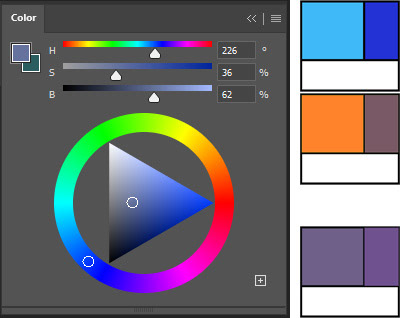
The final colour will slide down the colour ring towards the hue that you've added. Since orange is not an analogous colour to blue, it has a harsher effect on the colour. It moves the colour towards grey. Since the light is warm, we shift into the darks, which give us a richer colour and make the colour appear warmer. In this case, it comes out looking like a purple.
Some colours end up shifting drastically, which might make them seem out of place on the page, but because everything else is coloured according to the change, our eyes understand the lighting the scene is presented in.

Full Cartoon Colour Palette
Set in full-hue, the Full Cartoon Colour Palette can be seen as the baseline colours. This is meant to be understood in a strong, white, reflective light.


Mist Colour Palette
Set in light teals and blues, the Mist Colour Palette shows a scene submersed in a brightening fog.


Adding light teal lighting

Full Cartoon Palette, neutral, white lighting
into
Mist Palette, light teal lighting
Shop Colour Palette
Set in darker blues, the Shop Colour Palette deepens the blues in Sam's outfit towards blue-green, while neutralizing and darkening her skin tone.

Adding blue lighting, with a blue shadow
Full Cartoon Palette, neutral, white lighting
into
Haze Colour Palette
Set in a dark teal haze with a greyed purple shadow, the Haze Colour Palette starts to merge the colours into one block. The light and shadow fill colours are close enough together in value that they bring the range closer together.
Adding dark teal haze, with greyed shadows.

Full Cartoon Palette, neutral, white lighting
into
Deep Haze Colour Palette
Set in a dirty yellow, the Deep Haze Colour Palette shifts everything towards a warmer, murkier hue. This is meant to be understood as a strong light that brings the colours even closer together than "Haze", the previous colour palette.
Adding deep haze of yellows.

Full Cartoon Palette, neutral, white lighting
into
Graphic Novel Inspiration
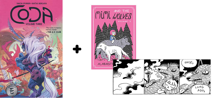
Line and texture inspiration from Mimi and the Wolves; Colour and gradient inspiration from CODA. Both references deal thematically with searching for belonging, while each has a distinct style.
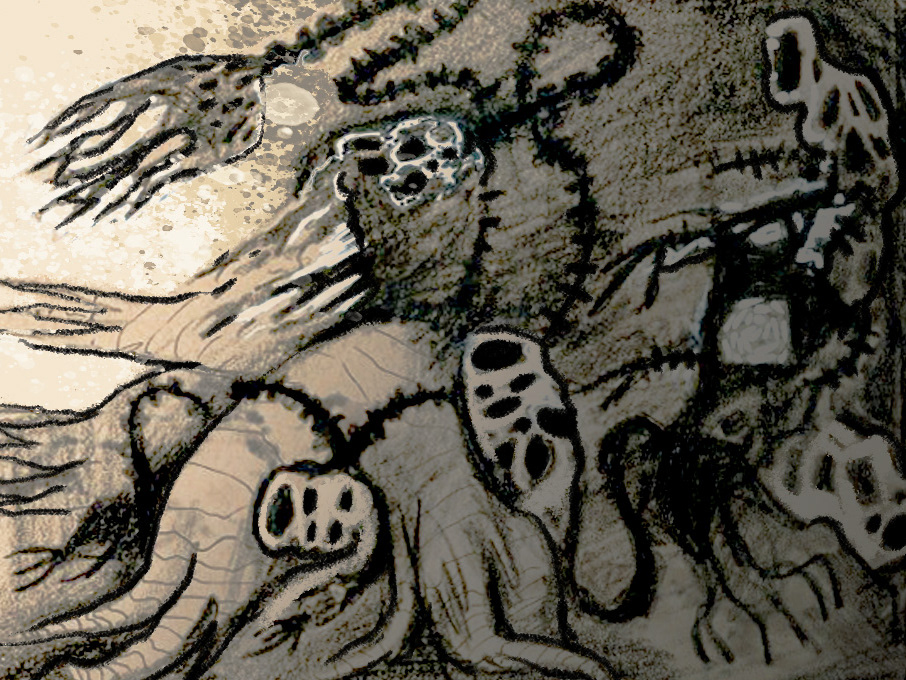
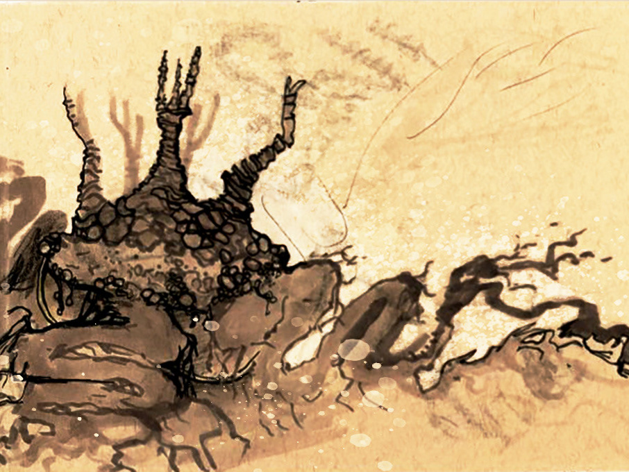
A final panel from the original take on the story, from 2021.